

SEP.com (the website) has been around since 1997. We’ve had a few iterations of the website since it was first built, from a 1990s tabbed site with a Flash game player to a static HTML site that required real coding chops to make simple content tweaks to a full redesign in 2020 with help from a third-party agency. Each version moved us a little further into modern web practices.
By 2023, that 2020 redesign was already giving us trouble. Content blocks were difficult to edit and reorganize. Page layouts were rigid. Colors, headline styles, and even element order were hard-coded, so even small changes meant a Twig and Tailwind development ticket.
To be fair, we work in a building full of developers. They’re just not the ones we could pull off client work to fix our own website buttons. So every “quick fix” competed with billable work, and usually lost.
That’s just the back-end struggle. On the front end, our accessibility, performance, and SEO reports told a story we didn’t love. The site wasn’t showing up well for our two most important audiences: people considering a job at SEP, and people considering working with us.
Cue marketing team panic. 😱
We didn’t rush the decision to rebuild. We spent 20+ months proving patches weren’t enough before committing to a ground-up, in-house redesign.
The Case for Starting Fresh
Our website’s job is to give people a sense of who SEP is, what we do, and what it’s like to work here or work with us. So it was humbling to realize how many table-stakes capabilities weren’t just missing. They were actively working against that goal.
For 20+ months before we ever kicked off a redesign, we patched, poked, and prodded the old site to see if we could get it there instead. We wanted the website to reflect the same expertise and attention to detail that shows up in our client partnerships. We tried a handful of fixes.
- Site search implementation with Algolia
- Patches to get Yoast SEO to read content stored in Advanced Custom Fields
- Image resizing, compression, and loading optimizations
- Navigation restructuring for new content
- Leaning on external tools, like HubSpot landing pages, when the CMS couldn’t keep up
None of it was enough. The site ran on 28 plugins, search felt clunky, and caching issues popped up on a rotation.
We tell clients that dependable software matters, especially when people rely on it every day. It was time to hold ourselves to the same standard.
We Started With Research, Not Wireframes
With the goal of designing the site in-house, we officially kicked off the redesign project in October 2024. Kelly Wilson, our Director of Marketing, brought our pain points to the designers and asked for help.
“We have an office full of talented people who do this work for clients every day. Getting to apply those same research and discovery processes to our own website was rare, and it made all the difference. Rather than jumping straight to wireframes, the designers helped us understand the problem first. We walked in with pain points; we walked out with a shared foundation for every decision that followed.”
—Kelly Wilson, Director of Marketing & PR, SEP
Starting with research instead of wireframes kept the project aligned from day one. When new ideas came up or opinions differed, we had real data to settle the issue instead of relying on whoever argued the loudest. The new SEP.com ended up thoroughly researched and evaluated before a single pixel changed.
What We Learned
Five methods drove most of what we learned, and each one surfaced something the team wouldn’t have caught otherwise. Here’s what stood out from each, pulled from the same types of design research our team runs on client projects every day.
Assumption Mapping
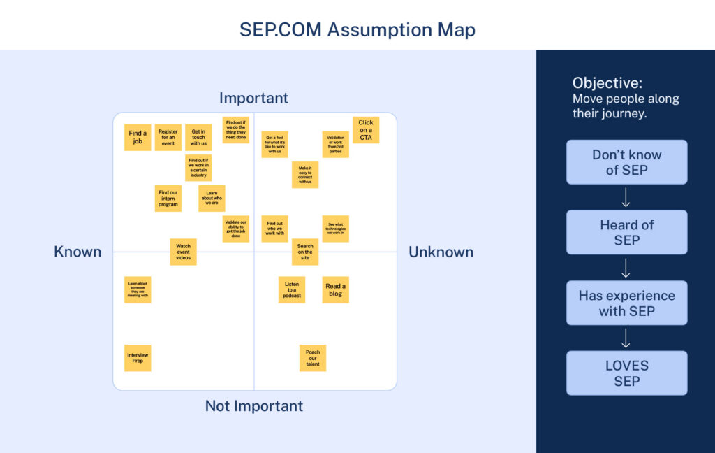
Our website’s job isn’t to explain everything SEP does. It’s to give someone enough to feel confident reaching out. That became our test for what to include: does this help someone pick up the phone or fill out a form?
We started with an assumption map. We assumed people were coming to the website for one of two reasons: To hire us for their project or to apply to work with us. But why else might they be coming to sep.com?
Competitive Analysis
Almost none of our direct competitors had a real site search, and the few that did stood out for it. A full-site search, filterable by content type, was a chance to show off our own UX work and make our content easier to find.
Card Sorting
“Capabilities” versus “Platforms” was internal language that meant nothing to users. Industry-specific content also deserved more space than we were giving it. Users expected it, our competitors were providing it, and some navigation patterns on our own site created unnecessary confusion.
Heuristic Evaluation
Users experienced friction and confusion navigating the site, even when they couldn’t say exactly what was wrong. Multiple paths led to the same page. Behavior was inconsistent across sections. And the accessibility gaps ran deeper than we expected, reinforcing that accessibility needs to be considered from the beginning of a build, not treated as something to address later.
Tree Testing
Our tree tests backed up the card sort findings and made the industry gap even harder to ignore. People couldn’t find industry-specific content because there wasn’t a clear home for it in the navigation.
Details Aren’t Extras
Accessibility was a priority from day one. There’s no single formula for an accessible website, but we wanted to be as rigorous about it as we ask our engineers to be for clients.
As Adam Sturm, SEP’s Marketing Graphic Designer, tested new brand colors, every option ran through a text-contrast checker before it made it into the palette.
“As a team we were hyper-intentional when coming up with SEP’s new brand colors. We used color theory to invoke the feelings and emotions we most wanted to convey. Blue for trust, violet for wisdom and creativity, green for growth, burgundy for leadership, and gold for teamwork/collaboration. These jewel tones work well together and bring a modern sophistication to the brand.
As you look through the site you’ll see that blue is at the core, solid and secure. Violet can be found as accents throughout the pages, and the Career section is dominated by gold to showcase our collaborative nature. At the same time, I have to work with these colors every day and I wanted to make sure they would have good contrast in any situation, be it on the site or in print or for the physical swag we like to make.”
—Adam Sturm, Marketing Graphic Designer, SEP
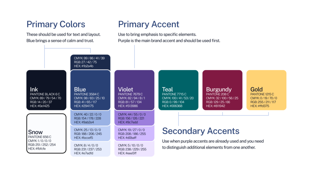
We kept checking color contrast throughout the design process, and we built in habits that matter for screen reader users.
- Descriptive link and button text
- Aria labels on clickable elements
- A heading hierarchy in order down the page
- Alt text on images and graphics
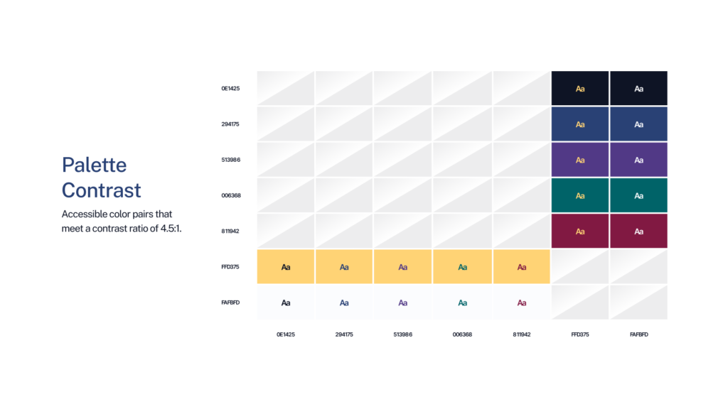
These sound like basics. They are basics. But on the old site, several of them weren’t handled well, and it showed. As we defined new colors, headings, and buttons, our lead project designer, Chris Hartley, set up a token system using Figma, Token Studio, and GitHub.
“A loose system feels flexible until three people interpret the same component differently and ship three different experiences. We were very intentional with the design system because that’s where trust is built. When you define structure, tokens, and behaviors at that level, you’re enabling every person on the team to work with a shared vocabulary and knowledge base.
The brand, voice, and visual artifacts stay coherent even when you’re not in the room. It’s how I try to think about any client project, especially in the world of AI — build the system so it scales, lives on without you, and can be picked up by someone else easily.”
—Chris Hartley, Senior UX Designer, SEP
The initial setup took more work than typical CSS styling, but we ended up with a token library in Figma that makes both small tweaks and future redesigns far more manageable. Chris had used design tokens before on an SEP client project for a mobile app, so we leaned on that experience and worked with our engineers to bring tokens to life for our own site.
Letting the Work Speak
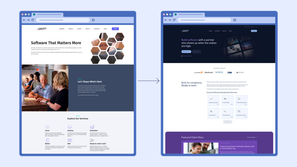
I could spend 300 words walking through the planning that went into every section, page, and block. Instead, here’s one example: the case study page layout.
Case studies are core to how we tell SEP’s story. Rather than listing our own accomplishments, our leaders prefer to show instead of tell. We don’t just say we’re experts in a language or platform. We show half a dozen client stories that prove it.
On the old site, a few things got in the way of telling those stories well.
- HTML editors instead of real patterns for testimonials, results, and project milestones
- Only the headline, intro paragraph, and What We Did section visible above the fold
- A large, non-resizable featured image sitting above the whole story
- Tagging limited to Platform taxonomy only
Based on competitor research and our own analytics, we found real value in giving people a snapshot at the top of each case study. Our new design still leads with the heading and intro, but now includes summaries for Opportunity, Services, and Results before anyone has to scroll.
The (Initial) Results Are In!
We launched the new SEP.com in early 2026, cutting the number of plugins from 28 down to 5. The site is now AccessiBe-verified as accessible and scores 100% on Google Lighthouse’s SEO and best practices reports. Since launch, we’ve shown up in more search results, ranked for 250 new keywords, and seen a real lift in case study pageviews. Those are solid technical wins.
But the marketing team wins matter just as much. With a full block editor and a custom pattern library, we can build rich pages, add testimonials, drop in FAQs, and update content without hitting a wall. No more rigid templates. No more development tickets for a simple text change. Our bloggers now have access to the same block editor and patterns for their posts, and we’ve already seen more of them writing.
The clearest sign it’s working?
Every person on the marketing team has, at some point, caught themselves saying, “I 🫶 our new website.”
✨ AI Post Recap
SEP spent over 20 months patching its old company website before starting a full redesign in 2026. The team used design research methods like card sorting and tree testing, built a Figma-based design token system, prioritized accessibility from day one, and cut the site’s plugin count from 28 to 5. The result is an AccessiBe-verified, 100% Lighthouse-scoring site with stronger organic search visibility and a much easier system for the marketing team to manage.
How long did SEP’s website redesign take? SEP patched its old site for over 20 months before starting a full in-house redesign in 2026, which itself followed months of user research, including card sorting, tree testing, and heuristic evaluation, before any wireframes were built.
What tools did SEP use to redesign its website? SEP built the new site in WordPress with a custom block editor and pattern library. The design team set up a token system using Figma, Token Studio, and GitHub to manage colors, headings, and buttons across the site.
What results came from SEP’s website redesign? After launch, SEP cut its plugin count from 28 to 5, became AccessiBe-certified accessible, scored 100% on Google Lighthouse’s SEO and best practices reports, and ranked for 250 new keywords.
