

In March 2022, two senior SEP engineers and I built a Hackathon project together. In brief, the project aimed to give users a report ranking their routes to work based on the number of potholes they would encounter along the way. We had a great time and were able to reach our goals. The project took shape as an Angular website that talked to a Python Flask server.
I’m a Software Engineer 1 at SEP, and this project happened within my first year at the company.
If you’re new to SEP’s Hackathon format, check out How We Run Company Hackathons.
The Inspiration
This project had a very specific inspiration. The image below is from my dashcam and was captured seconds before disaster.
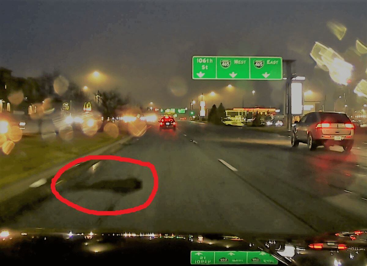
Yep. On my way to work one day, that abomination took out my front left tire. The pothole pit was new to this world, the spawn of yet another freeze-thaw cycle that occurred the previous weekend.
The experience left me frustrated, but it also introduced me to resources provided by the city of Indianapolis — namely, Indy Pothole Viewer*.
This site presents pothole coordinates overlaid on a map of Indianapolis. Potholes get removed as they are repaired- in fact, every visualized pothole links to a real service request to fix it. The site also allows users to report new potholes.
I’ve found that starting with preexisting high-quality data is an easy way to make a cool project. For a past example in this style, see https://github.com/ianhaggerty3/tetris-stats. With the Winter Hackathon coming up, my brain was spinning with possibilities.
The Pitch
Around Hackathon time, I prepared not only to take part, but to pitch an idea. I aimed to make use of the Indianapolis pothole data to reveal information about specific routes.
I played up my anger for showmanship, naming the project “Streets of Rage”. The project was to “Tell you how angry you would be after taking a given route to work”. One of my goals was for the project to “Tell me when Meridian Street is better”.
As a first-time participant, I half-expected to ditch my idea and hop onto somebody else’s project. My peers at SEP said no. The pitch gained a lot of traction with the audience, including high praise from CEO Raman Ohri.
This is genius!
– Raman Ohri
I’m an anxious public speaker, but the energy in the room helped to get me rolling. Once the dust settled, two veteran engineers had signed up to support my idea.
The Team
My two close collaborators were Tom Atnip and Leon Organ. Tom is a Senior Software Engineer whose recent work involved Microsoft Azure. Leon is a Software Producer, and brought a strong technical background and Product Owner experience.
Tom’s Azure experience was invaluable in hosting our Flask server in the cloud. He also helped effectively use the Google Maps API, and commingle its data with that from Indianapolis. Leon focused on scraping the data and also took an interest in the spatial coordinate systems involved. I brought my competency over the chosen technologies (Angular frontend, Python Flask backend), as well as a vision for the whole project.
These are not the only SEPeers who helped out. Jon Fuller took great care to make sure that I got up and going with SEP systems. He also set our team up with a Google Maps API key. So many others helped pull off the event as a whole and gave us a surface to bounce ideas off of.
Getting the Data
We entered the weekend with nothing but our idea and hope, against better guidance. How to retrieve the Indianapolis pothole data was still an open question. Answering the question involved some wily reverse engineering and creative Python scripting.
Indy Pothole Viewer serves up a scalable graphic that has pothole data encoded in it. During the Winter, it’s a bit of a mess.
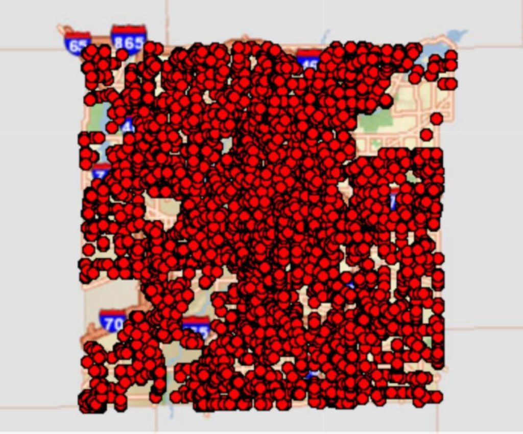
Trying to take the pothole data directly from the graphic would have been a lot more “held together with spit and glue” than we were comfortable with, even for a Hackathon. So, we went to the server providing the underlying data. Surprisingly, it was amicable to our requests for information.
We found a way to request pothole data for a given region of Indianapolis. We had to define these regions using EPSG:2965 coordinates. This is a coordinate system, like lat/long, which is specialized for Indiana.
EPSG:2965 uses units of US Survey Feet, a deprecated unit that is slightly different from the typical “International Foot”. The old unit has mostly been phased out, but is used for projections like this. For more information, see A Tale of Two Feet.
We soon discovered that we would need to send multiple requests to get all the data. This is because the total number of potholes exceeded the limit for a single query. Leon found a way to iterate across the full area while Tom and I pushed ahead.
Integrating with Google Maps
Our goal was to provide additional information to users about their possible routes to work, or anywhere. Google Maps seemed the easiest way to get a list of possible routes between two locations.
We found the Maps API to be very well-designed and thorough. Documentation meant that no reverse engineering was necessary. We decoded the polyline used to draw each route and processed it into a list of relevant lat/long coordinates.
Combining the Data
Indianapolis pothole data does not use lat/long, so coordinate conversion is necessary to find where potholes intersect a route. Fortunately, pyproj made this easy.
At the time, this library was the primary bottleneck for performance. Transformations on route data took over 40 seconds per request. This could have been solved in many ways, but with a tightly limited project time, it was left alone.
We decided to convert directions from lat/long to EPSG:2965. One reason for this was that “Survey Feet” were just easier to work with in terms of asking “Is the pothole within n feet of the route?” If we were to go the other way, we’d need to make some approximations, since longitudinal distance depends on the current latitude. Essentially, the work (however minuscule) of pretending Indianapolis is flat was already done for us in EPSG:2965.
Our approach to finding potholes along a route was to check if a given pothole was within a certain distance of a given route line segment. We filtered down the potholes at times so that we wouldn’t have to constantly consider all of them. This computation, while expensive, was not much compared to the coordinate conversions.
Our project did not attempt to determine which side of the road each pothole was on. We hoped that it generally averaged out, although this information would be highly useful.
Building the Website
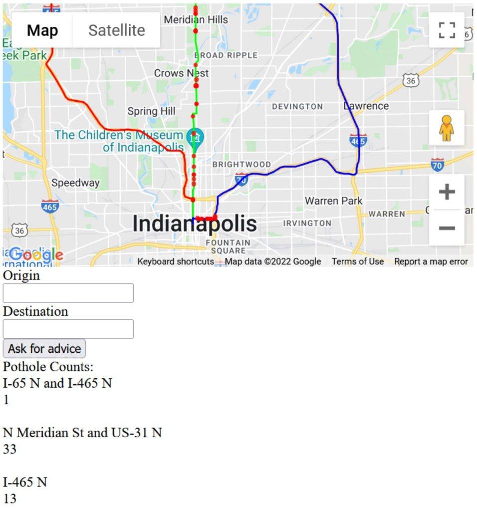
We approached the UI as barebones as possible. We kept adding elements until we met the stated goal. The site leveraged off-the-shelf map components as much as possible. Because of this, we prioritized drawing red circles at pothole locations.
We learned that it is necessary to include the Google Maps API key in the UI to render the map. Its permissions needed to be heavily restricted to prevent bad actors from using the key to rack up a bill. We took the site down soon after Hackathon, since this problem wasn’t addressed.
Two seasoned engineers joined my project, but no designers. For the record, us engineers could have come up with something better given more time. I hope the abomination you see above can be a motivation for at least one new UI designer to attend this year’s Winter Hackathon (slated for February 24-26!).
The hope is that, despite the site’s clunkiness, the number of potholes next to each route could give the user valuable information. They could notice a big spike after a temperature drop and decide to play it safe. Or, they could see the number finally drop after being high for a while, and decide that a preferred route is viable again.
Hosting
I selected GitHub Pages to host the frontend for its simplicity and ease of use. It took minutes to figure out, and I highly recommend it for Hackathon projects with a web frontend. Making it work with Angular was as easy as installing a package.
Tom used Azure to host the backend during the last hour or so of the event. The speed of getting it online impressed me, but I don’t have a great understanding of how it worked.
The Demo
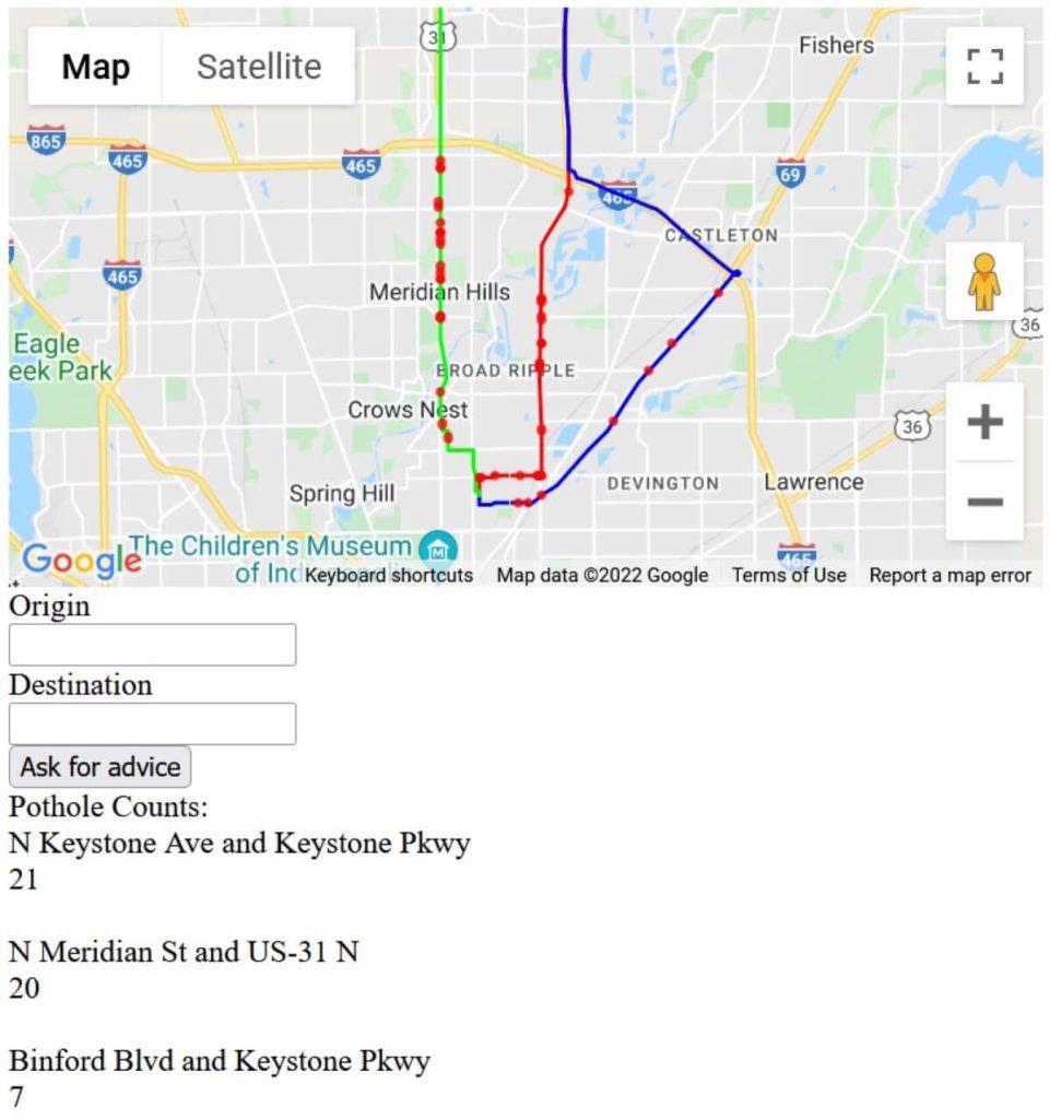
While our project was publicly online at the time of the demo, we weren’t able to get the audience to participate and use the site. Computation took so long that it was remarkable I could show off a single “Request for Advice”. The screenshots you see in this post were used to make sure the audience got an idea of where we ended up.
Retro
I can’t speak highly enough of my teammates. From start to finish, they worked to support my vision. To Tom and Leon’s credit, they provided many technical and product recommendations while making me feel in control. I got a sense for what it would be like to be a client working with SEP, and I felt unstoppable.
The idea was cool. We had some challenging problems to solve. We met the stated goal. I enjoyed the weekend.
– Leon Organ
Looking back, I wish I had spent more time following their technical recommendations. For example, “Let’s be explicit about following an extract, transform, load (ETL) process”, and “Maybe we should be using an actual database”.
This was my first Hackathon with SEP, and after such a fulfilling experience, it will not be my last.
Post-Hackathon Improvements
At the time of writing this post, it has been nearly a year since we executed the project.
I found some time to improve the coordinate translations and got satisfying results. We went from 47 seconds per request to 4 seconds. This makes the website borderline-usable, but there are many more improvements to consider.
If this idea were developed into a full product, we would have many interesting challenges to face. I thought of two options that it could evolve into. It could fully integrate with a mapping software as a plugin. It could also send alerts to users about routes they care about. An approach like this is necessary because we can’t expect our app to win in a fair fight against the existing behemoth mapping apps.
From a licensing perspective, we’d want to establish formal business relationships with both the Indianapolis Mayor’s Office (publisher of Indy Pothole Viewer) and Google Cloud. It is not clear that the pothole data API was intended to be used by anyone other than Indy Pothole Viewer, so we would certainly want the blessing of its creators. Also, while we were paying for the map data from Google, the rules change once that API is being used in a commercial product. Google frames it as a “come talk to us” situation. Open source alternatives could help get around this at the expense of missing out on that smooth, smooth API.
Generalizing past Indianapolis would be an uphill battle. Pothole data for other locales sometimes exists, but it certainly doesn’t follow a unified format, and other data is likely not as golden as that published in Indianapolis.
Fun Facts
– Each pothole has an Indianapolis address in the database.
– Pothole coordinates are in a specialized coordinate system using deprecated units of “Survey Feet”.
– Since the town of Speedway, IN, is independent from Indianapolis, it is a dead spot in the pothole map. The same is true for Beech Grove.
– Interstates are not under the jurisdiction of Indianapolis, so potholes along them (though much rarer) are not in the data.
* Indy Pothole Viewer is hosted by https://maps.indy.gov/ and is temporarily unavailable.