

Collaboration between design and development has historically been an uphill battle. It used to be that a designer (or team of designers) designed a software application, and then handed it over the fence to the software engineers and wished them the best of luck. As you can imagine, this silo approach ended in unexpected results and lots of wasted time interpreting and building the wrong application.
Over time we’ve seen new approaches and methodologies emerge, and at SEP, that handoff has steadily become an ongoing collaborative relationship. We invite product and development teams to participate in research and discovery with the design team. And encourage designers to take part in product and development conversations throughout the entire project.
I’ve found these three tactics to help tear down the silos and foster better collaboration on my teams:
File Organization
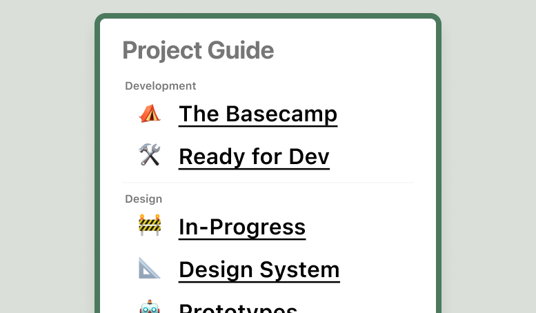
Project files can get messy and unorganized if we’re not careful and intentional. To help combat this, I have created a Project Guide in Figma that links to the appropriate tools around the project and the internet. No matter how your team organizes your project, this guide can serve as the one source of truth.
Matthew Loria, Senior Software Engineer, on our team weighed in:
On past projects, I have run into issues referencing outdated designs as I’m coding. Having this project guide with a Ready for Development section (and an archive) has helped me ensure I’m only referencing the approved designs.
The One-File Project
If your project or team is smaller, maybe it makes sense to keep everything in one file. Try using emojis and special characters to keep page structure and conventions clear.
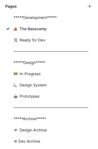
Table of Contents
If your team has a variety of active members, this simple table of contents approach may be a good fit. You can find this file available for free in the Figma Community.
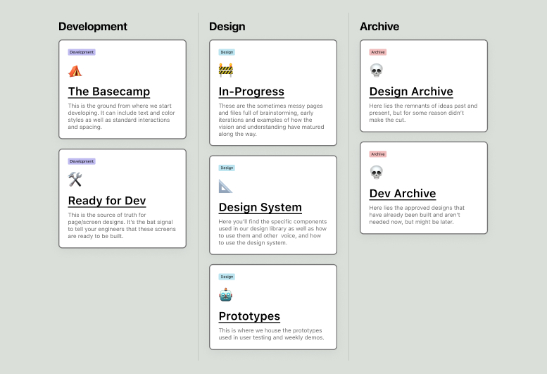
More Complexity Needs More Clarity
If your project is a little more complex or your team could use brief descriptions, this tile layout may make more sense. Here is a link to this file in the Figma Community.
The Basecamp
After ensuring the files are organized and accessible to everyone on our team, we set our development team up for success. We create a centralized space for common assets and interactions to live, which we call the Basecamp. This is the foundational ground from which we start developing and helps reduce the tendency to over-document throughout the file. It can include anything from text styles and color applications to guidelines for standard modal interactions or spacing between inputs and buttons in forms.
Matthew shared his experience working with Basecamp styles:
The Basecamp styles have been a huge help in speeding up my UI development. I’m now able to reference those styles while developing approved designs and later rapidly prototype an exploratory experience that the team is evaluating.
When creating your Basecamp, this is a great time to explore how you want to communicate documentation with your team. Here are a few ideas:
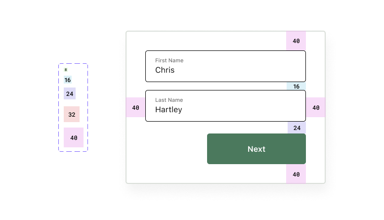
Spacers
Use a series of Variants to show consistent spacing. Here is a link to my Community file that includes both 8px and 10px grid systems.
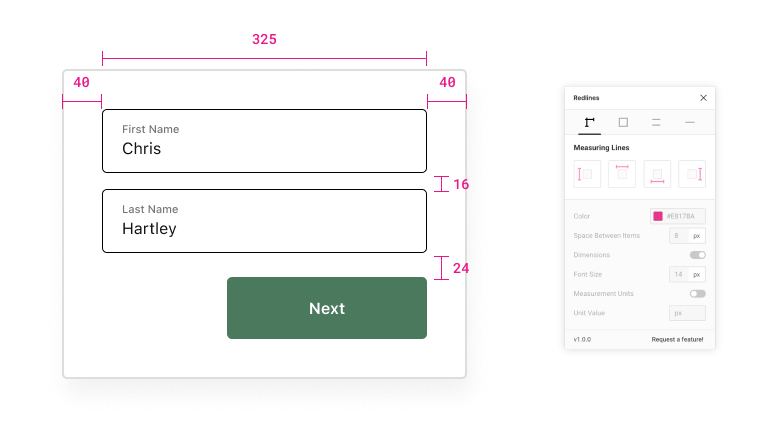
Traditional Redlines
If a Figma plugin sounds more appealing, this Redlines plugin is a standard approach to redline documentation.
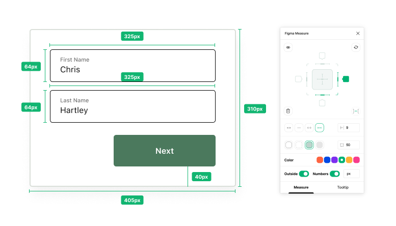
Enhanced Documentation
Another helpful Figma plugin is called Figma Measure, which includes all of the features from the Redlines plugin with more automation and visual indications like font families, weights, etc.
Documenting in the File
When you need to document particular screens or interactions, it’s important to find and customize an approach that fits your team.
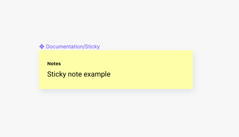
Starting Simple
As our team started a recent project for an international IoT (Internet of Things) client, we started documenting with a simple sticky note component.
Scaling Up
From there we needed a little more scalability, so I created simple card components with a few standard headings and states. You can duplicate this file in the Figma Community.
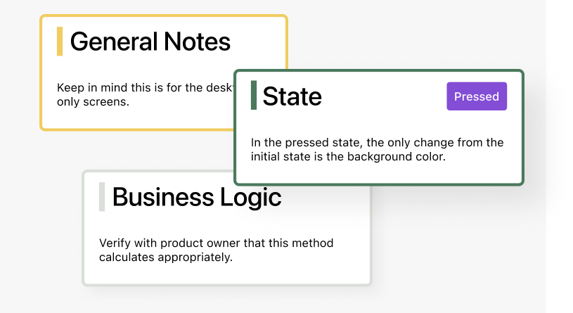
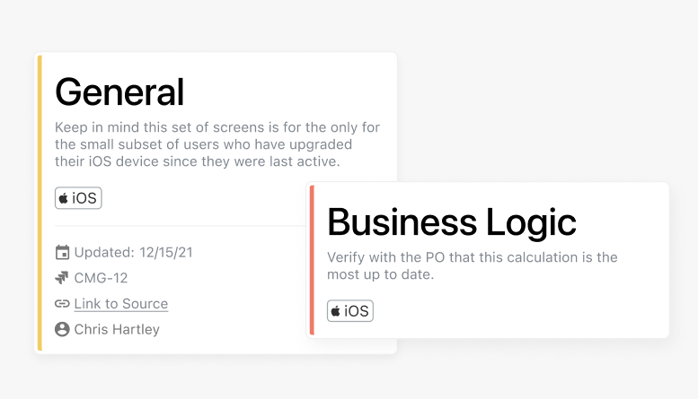
More Clarity at Scale
As we ramped up the project, we found a need for more clarity in these cards, like the intended platform (ex. iOS or Android). I recently published an updated library that added fields for an associated ticket (Jira in our case) to help draw parity for our engineers. I also included the last updated date, external links, and the designer responsible. Here is a link to a public version of this file in the Community. It’s five components totaling over 1,000 Variants!
Wrapping Up
I hope this has sparked some ideas to try with your team based on how our UX and engineering teams break down silos and collaborate better. I would love to hear how these have impacted your team. You can find me in the Figma Community (as well as all of the files mentioned above) at @chrishartley or on Twitter at @chris_hartley.
Let’s build awesome things together.
Our approach to Product Design & UX is holistic, integrating business, tech, user needs, and market demands.