There are already a bunch of articles on the interwebs with advice for designers fresh out of school, so I wanted to share the technical skills I wished I had honed to perfection before embarking on my design career. Most of them are based around the Adobe Creative Suite. I apologize in advance if it sounds like a lot of design minutia, but I hope it helps someone somehow.
Master the Pen Tool

I mean really master it. It will become your best friend. Especially when designing icons or logos. When drawing curves, know the best placement for anchor points to get the smoothest curves. Know the function of the convert point tool. If you are using Illustrator, if you can’t get the curvatures just right, use the simplify path function to clean up the lines.
Paths
This goes along with mastery of the pen tool. Know how to create paths and how to convert those paths into selections. This will help out immensely when clipping out selections from images, or applying effects only to those selections.
Pathfinder (Illustrator)

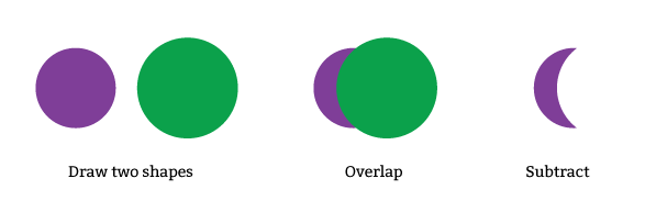
Sometimes the easist way to arrive at a desired object is to draw a shape and either add another shape to it, subtract another shape from it, or a combination of both. This can be done with the Illustrator pathfinder feature.
Photoshop Curves and Levels

These tools are most helpful when color correcting images. Understand how to set the white point and black point, and what that does to an image. Rarely have I received perfect photography for use in my designs. Some color correction is always necessary, especially when working in print design.
Scaling Images
When scaling in Photoshop, understand the quality differences between bicubic and bilinear scaling.
Clipping Paths and Masking

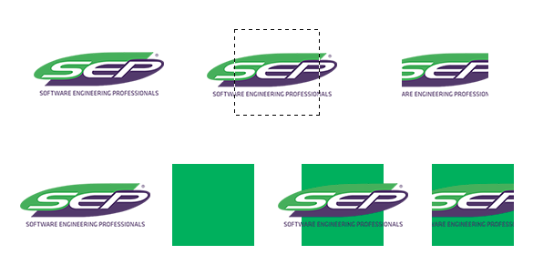
Sometimes you want to mask an image within a certain shape but retain the ability to move it around and experiment with the cropping. Clipping paths and masks can help with this.
Pixel Perfect Design
![]()
I’m still perfecting this skill everyday myself. This skill is very helpful when designing icons. My first rookie mistake when designing icons was simply scaling down an icon when it was needed at a smaller size. Aliasing will always cause a scaled down icon to look different at smaller sizes. Going in at the pixel level and tweaking is always required. Always designing with vector paths is a must, and always have “Snap Vector Tools and Transforms to Pixel Grid” selected in the Photoshop preferences.
Image Degradation
If working with JPEGs, understand how its image quality degrades every time the file is opened, edited, and saved. I prefer to work with TIFFs and PNGs, formats that are not lossy.
Compositing
When “shopping” someone or something into an image, the most realistic results come from an understanding of lighting and edge quality. The healing brush and clone stamp tool can help here. The worst photoshop jobs stand out because you can notice the hard edges and lack of blending.