

Creating beautiful, well-laid-out screens may seem like design magic, but you don’t have to be a designer to know how to structure your content well. With just a few key fundamentals of hierarchy, you can drastically improve both the visual appeal and usability of your designs.
What is hierarchy and why is it important?
According to the Neilson Norman Group, visual hierarchy is “the organization of the design elements on the page so that the eye is guided to consume each design element in the order of intended importance.” When done well, designs should be instantly easy to understand. A lack of hierarchy in a design can frustrate the user and even cause them to lose trust in the product.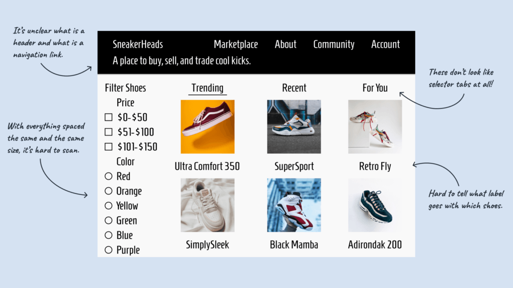
The Building Blocks of Hierarchy
Hierarchy can be broken down into three different parts: visual grouping, visual weight, and information architecture. Each of these parts plays a key role in making content easy to consume.
Visual Grouping
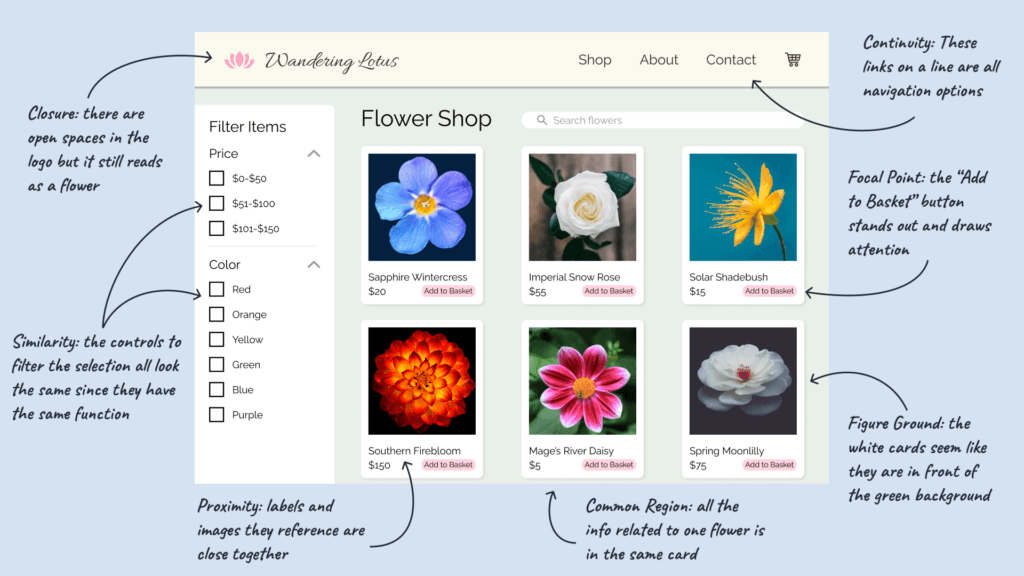
Visual groupings help the user understand what information goes together. If everything on a page is laid out equally, the user has to consume it all and then mentally sort it themselves. Visually grouping things saves the user some brainpower and makes content scannable.
One tool that can help you visually group elements is the Gestalt principles. These principles come from psychology and they explain how the brain processes visual information. They can help you understand how people see patterns in your designs and how you can guide the user’s attention.
There are seven total Gestalt principles:
- Closure
- Proximity
- Continuity
- Similarity
- Figure Ground
- Focal Point
- Common Region
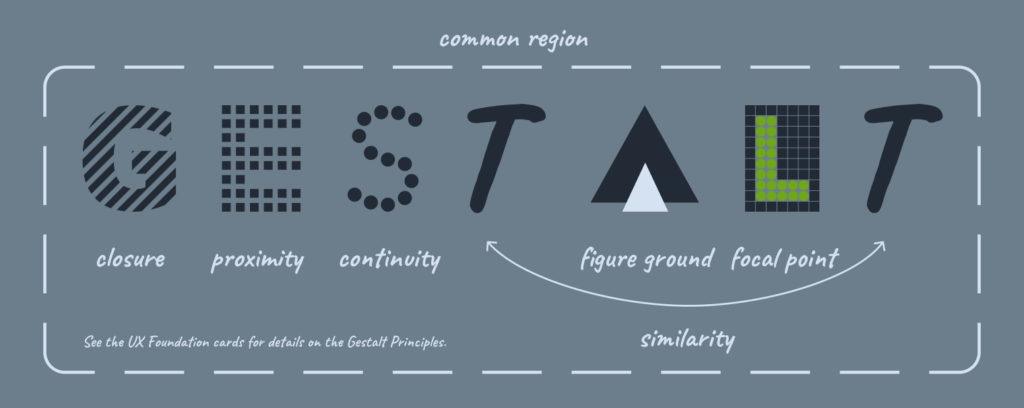
The Gestalt principles have many applications in design, but the most helpful principles for visual grouping are common region and proximity. Items in close proximity or in the same common region, like a card, will be interpreted as related.
Visual Weight
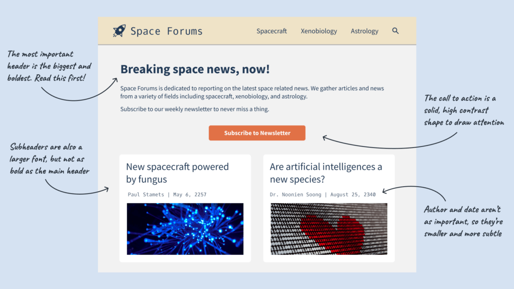
The concept of visual weight is how much attention an element draws. If an element has a high visual weight, it will be eye-catching and seem more important than other “lighter” elements. Users’ eyes will naturally go from the heaviest to the lightest elements. Adjusting the visual weight of different elements affects the order users consume content.
Some characteristics that can affect the visual weight are:
- Size
- Contrast
- Shape
- Position
Things that are larger or have higher contrast draw a lot of attention. More solid objects are perceived as “heavier.” Additionally, since we read from top to bottom, elements at the top are seen as more important than elements near the bottom. A bolded header at the top of the page is going to stand out much more than a smaller piece of text in a secondary color.
Information Architecture
Information architecture is a complex field that encompasses many aspects of categorizing and presenting information. For now, just make sure these three things are understandable:
- Terms
- Groupings/Categories
- Reasons for grouping
Terms and groupings should be easy to understand without looking up definitions. It should also be clear what a group is and why something belongs in the group it is in.
A good example of information architecture is a grocery store. If food was sorted into categories like “tasty” and “earthy,” you may not be able to find the items you need. What exactly is an “earthy” food? The person sorting the food may have a different opinion of what “tasty” food is. In this case, it’s better to sort the food by categories that everyone knows like “produce” and “dairy.”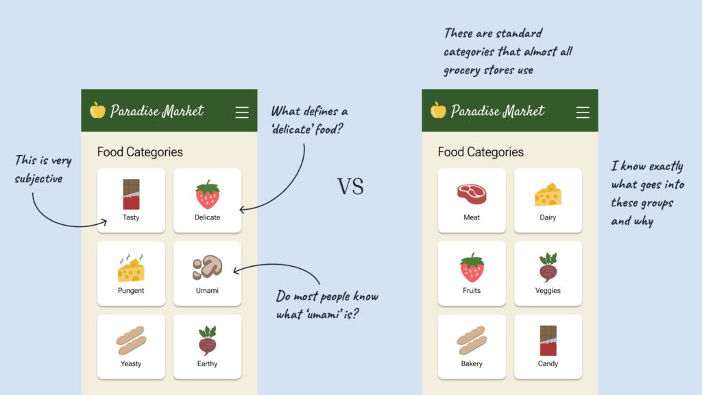
Assembling the Building Blocks
Now that you know the building blocks of hierarchy, you can start putting them together. Visual grouping and visual weight can be used together to create the visual hierarchy of design elements. Information architecture can function as the overall blueprint for your content’s organization.
Start by making sure you understand your terms and how they all fit together as a system. What elements are related? How should you group things together?
Next, take some time to think about which elements are most important or what you want the user to notice first. This is the beginning of your hierarchy. Once you know the priority of your content, you’ll know which elements need a higher visual weight.
Once you know your content’s groupings and priority, it’s time to start styling the elements. Things you have determined to be most important should be bold and stand out with a high visual weight. Supporting elements should have less visual weight and be close to their related counterparts.
In conclusion…
You may not be a designer, but these fundamentals of design hierarchy can help you to structure your content in a logical and appealing way. Remember to visually group related elements, adjust visual weight based on priority, and keep your information architecture understandable. Soon enough you’ll be on your way to well-structured designs.
Learn More
Download the printable cards and slide deck to learn more!