Context
SEP started with developers, grew by hiring more developers, evolved by hiring designers. And since the developers “were here first,” there’s an easy and terrible potential for us to think of “incorporating designers into the development” rather than “incorporating developers into the designing.”
My team chose a third way, which you all probably know as Dual Track Development, where we came together as one team under product. The idea being that the entire team is responsible for and invests in the entire product development process. It requires developers investing in discovery and design, and designers investing in development and delivery.
Our problems
My team is a group of 8, made up of 1 product owner, 2 designers, and 6 developers. We experienced a few problems with the way that we originally organized a team of developers and designers.
Problem 1
Our developers were completely ignoring designers when they ask for a developer’s input on a design work item.
Problem 2
Our designers weren’t being looped into the work in progress. I remember this one work item about changing the content of an email alert. We were all “oh there isn’t any UI in this so we don’t need a designer,” thinking that because we weren’t putting a button on a page, designers wouldn’t be interested. Wrong. An email is still a user interaction, and was totally within the right of the designers to weigh in. This work item got accepted without key information that our designers learned through user interviews.
Problem 3
Our developers had no idea what work was coming down the pipeline. I remember two planning meetings in a row where we all sat down at a big oval table to plan, and only then realized we didn’t have any work prepared enough to start on.
Designers & developers are totally different, in the best way possible
Since we were a development shop first, we have a lot of language around incorporating designers into development teams and processes rather than the other way around.
After all, our developers outnumber our designers 10 to 1. So we have teams of developers. That team may have a designated designer.
After all, development work is uniform(ish), measured, predictable(ish). Design work is chaos, and so it should be tamed to be more uniform, measured, predictable, no?
No.
We’re different. And that’s amazing, because our work is different. Here are a few of the ways we realized had fundamental differences:
Difference: The size of our work
Where development work is roughly made to be the same size, design work is not expected to be anywhere close to the same size.
Design work, after all, is an idea. Are your ideas about ethics the same size as your ideas about sandwiches? Even writing that, I’m chuckling to myself because sizing an idea seems like such a silly concept. How can you even measure an idea? Is that even a worthwhile exercise? Doubt it.
Difference: The flow of our work
Where development work is very linear, very left-to-right, design work is extremely cyclical.
We developers have a very gross word for this, “churn.” Like – I feel bad if my work moves backwards on the task board because it always means I missed something. I tell myself it’s something I should have caught, could have prevented, if only I have been better, asked more questions, dug into the code more.
Designers aren’t shackled by this “measurement” of goodness. I asked a designer once, “Okay, if bouncing back and forth between columns is totally expected, how do you know you’re doing well?”
She feels accomplished every time we uncover something new, learn something new, find a new question to ask.
After all,
How do you measure all of the crappy solutions that didn’t get made? How do you measure how well you interpret a client’s vision? How do you measure how much you learned about an idea?
Difference: The height at which we view our work
Where development work is 100 feet, design work is 265,000 feet.
I had a major hang up about why day-to-day design feels so cyclical when day-to-day development feels so linear. We’re both working on the same product, so why are our work flows feel so different.
I need a metaphor to explain what I believe is the answer. Designers are calling a race as astronauts in space. Developers are running the race on the ground. When you’re on the ground, the distance in front of you looks very linear. When you’re an astronaut you’re literally orbiting, capturing things from totally different angles. Your world is very spherical.
I believe this is why design work moves cyclically. While a developer can focus on a very precise piece of the product, designers must balance the focus on one idea with the entire product.
Now that we understand each other, how do we work together?
With a newfound, shared understanding of each other’s work and process, we tried some things so that our working style reflects the actual shape and nature of our work.
Experiment: Make design work transparent
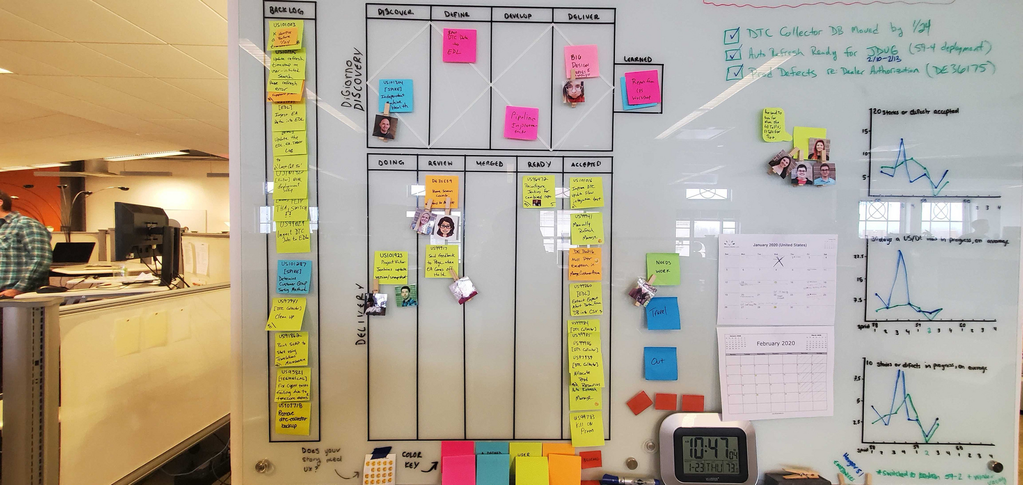
The team chose to the double diamond to our board as a way to track our design, and more generally our discovery work.
Key Features:
- A shared backlog, which helped us determine where discovery/design items were prioritized with respect to our usual development work.
- The Discovery Task Board, which helped us to visualize what stage the design work was at.
- The “Learned” Box, because we’re still engineers and we need to measure something. We decided to measure the number of ideas that we learned enough to decide whether it was going to be trashed or set up in the delivery pipeline.
- The Delivery Task Board, your standard developer kanban board.

Experiment: Attend each other’s meetings
Developers started attending some design activities:
- Product Design Studio
- Story Mapping
- User Interviews
Designers started attending some development activities:
- Domain Walkthrough
- Daily Stand-Ups
- Work Item Acceptance
Okay great! So what happened?
Outcome 1: Higher Engagement
We started asking better questions during our daily planning meeting. Less crickets, more “oh designer, how many developers would you need for that? Can you throw something on our calendar.”
Outcome 2: A More Natural Workflow
We realized that some of our “delivery” tasks were actually discovery tasks. Things like technical prepping of work, spikes, investigations. There was a collective “ooOOoohhhh” when we walked our technical prep items through the double diamond. The double diamond felt more natural than using our development task board.
Outcome 3: Increased Transparency
We saw more detailed information into what our Product Owner was working on. Less “what the heck is up next?”, more “okay do you need a developer in figuring out the feasibility of that feature?”
Outcome 4: Better Preparation
We always had work to do. Our backlog never ran low. While we’ve always had a ton of work items in our virtual ticketing system, they weren’t necessarily workable tasks until they appeared on our physical work item board. We used to have quite a few things get stuck in the space between the two. Seems like whatever issues we had in that gap disappeared during this experiment.
You Might Also Like