

This article was co-written by Jeremy Jarvis and Dante LaRocca.
In our data-driven world, businesses rely on understanding the data that drives them. This involves visualizing data in a clear and digestible way, enabling them to make informed decisions. Even if the data is rich and accurate, the visuals must be carefully designed to surface what’s relevant. In some cases, you can achieve this using simple charts (bar charts, line charts, pie charts, etc.). In other cases, you would be best served by building custom charts that visualize the deeper relationships within the data. Today, we will explore how to create custom Power BI charts to empower your data.
Custom Charts in Power BI
Power BI is a tool that enables people to build reports that visualize data. It is part of Microsoft’s Power Platform, a family of cloud tools that enable business intelligence, app development, and interconnectivity between cloud components.
With Power BI, you can visualize your organization’s data using out-of-the-box visualizations like bar charts, line graphs, and tables. But, you may encounter a situation where those built-in charts don’t provide what you want to visualize. For example, you might want to visualize your data using a combination of lines, bars, and other elements. Power BI might provide that specific combination out-of-the-box, but Microsoft has thankfully provided a means to generate custom visuals via a Node.js library called powerbi-visuals-tools (pbiviz). This library contains a CLI interface that you can use to generate a template pbiviz project. You can then update the project with whatever custom visualization logic you need.
Here is an example of a custom visualization:
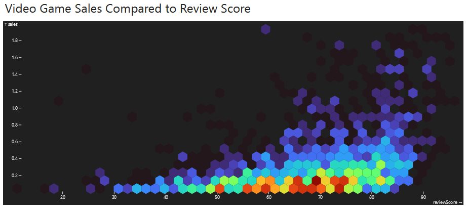
We built this using a third-party visualization library called Observable Plot, one of several charting libraries out there.
What we will show you
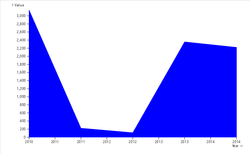
In this article we will provide step-by-step instructions on how to set up a pbiviz project. We will walk through the files and code that you need to be familiar with. We’ll describe how to bundle up your visualization and use it within a Power BI report. We will also go over some limitations that you should be aware of. To keep things simple, we will use a small set of data and render it as an area graph (shown below). We will be using the same Observable Plot library to render this graph.
Let’s dive in!
Power BI Desktop vs the online Power BI Service portal
There are two ways for users to build and interact with Power BI reports: the Power BI Desktop application and the Power BI Service portal. With either tool you can format your data to produce graphs, charts, and tables. The Desktop app is a tool for creating and publishing reports, whereas the Service is where you can view, debug, and share reports with others. You can load data directly into a report as a one-time import, or make live connections to data sources to allow the report to update as new data enters the system.
During this article we will first show you how to create a custom visualization and import it into Power BI Desktop. Later, we’ll show you how to run your visualization locally and use the Power BI Service to set up a quick development cycle.
Project Setup
To begin, install Node.js if not already installed. The powerbi-visuals-tools library requires you to be on Node 18+.
Next, run this command to install the CLI tool.
npm install -g powerbi-visuals-toolsThen, to generate the project template, navigate to the parent directory where your code will live, and leverage the following command replacing “<visualization name>” with the name you wish to use. Note that the name can only contain alphanumeric characters.
pbiviz new <visualization name>Project Overview
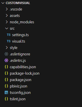
Once you have created the project, open the directory to see the generated files. Standard node elements will be present: a package.json, package-lock.json, TypeScript configuration with tsconfig.json, and linting configuration files.
In addition, there are some framework-specific files that we need to call out.
pbiviz.json
This file contains all of the metadata that will be associated with the compiled visualization. Here is an example of a generated pbiviz.json file.
{
  "visual": {
    "name": "blogdemo",
    "displayName": "blogdemo",
    "guid": "blogdemo2DD35849B16241149444116BDA3A29B6",
    "visualClassName": "Visual",
    "version": "1.0.0.0",
    "description": "",
    "supportUrl": "",
    "gitHubUrl": ""
  },
  "apiVersion": "5.3.0",
  "author": {
    "name": "",
    "email": ""
  },
  "assets": {
    "icon": "assets/icon.png"
  },
  "externalJS": null,
  "style": "style/visual.less",
  "capabilities": "capabilities.json",
  "dependencies": null,
  "stringResources": [],
  "version": "1.0.0.0"
}
Note that you will need to populate the description, supportUrl, and author information. These properties are required to package the project (which we’ll get to later).
capabilities.json
This file is responsible for defining data mappings and custom parameters for the control. These mappings directly affect what data fields can be passed into the control through the Power BI interface. They also affect what custom parameters you can set when configuring the control. The schema is somewhat complicated, but the main properties to be aware of are the dataRoles, dataViewMappings, and objects.
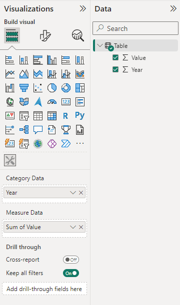
- dataRoles define how the data fields will appear when configuring the visual within Power BI. These are grouped as Grouping or Measure fields, where the Grouping type denotes that the data can be grouped by the field, and the Measure type denotes the data for any given set of Groups. Here are the dataRoles that were automatically generated:
<div>
<pre>"dataRoles": [
{
"displayName": "Category Data",
"name": "category",
"kind": "Grouping"
},
{
"displayName": "Measure Data",
"name": "measure",
"kind": "Measure"
}
]</pre>
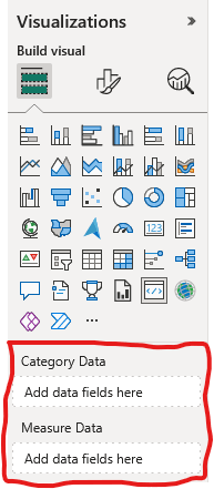
</div>Here is a preview of where these will show up later in Power BI, within the Visualizations panel:
- dataViewMappings are the mappings between the dataRoles and the TypeScript project itself. This will group the dataRoles fields into known aggregation constructs (tables, categorical, matrix, etc.), which then define the structure of a dataViews collection for access within the TypeScript logic.
- objects define how custom parameters and settings will be passed into the control.
src/settings.ts
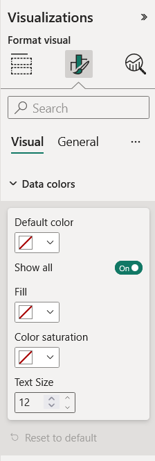
In this file we map the objects defined in the capabilities.json file to custom controls that will appear in the Visual tab in Power BI when formatting the visualization. These controls could be ColorPickers, Dropdowns, TextInputs, etc.
The generated code provides “Data colors” settings like default color and text size. Here is where these settings will show up later in Power BI, within the Visualizations panel:
src/visual.ts
This file is where you will define the visualization’s behavior. The file contains a TypeScript class that implements the IVisual interface, consisting of a constructor, an update function, and a getFormattingModel function.
- The constructor, as one might expect, is responsible for initializing the control. It takes in two pieces of data to accomplish this. The first is the target html element where the control should be rendered. The second is a set of host properties needed to initialize the control and/or need to be configured once, as they do not change during the visual’s lifespan. You can save these parameters here for future use, or consume/update them within the constructor.
- The update function takes an options parameter that contains fields required when updating the visual. The most important of these would be the dataViews array, which contains the data passed in from Power BI (as defined by the capabilities.json). The update function is where any update/redraw logic should live in order to keep the visual up-to-date with data and property changes.
- The getFormattingModel function is responsible for returning the custom settings model for the visual (as defined in settings.ts). Power BI will call this function in order to populate the Visual tab when formatting the control in the Power BI report.
Create a custom Power BI visual
Now that you know what each file is for, you can change the code within src/visual.ts to draw whatever visual you wish. For example, you can render a chart using a third-party library like @observablehq/plot which we mentioned earlier. Let’s walk through a simple example that plots an area graph.
1. First, install the library to your project with npm i @observablehq/plot
2. Update the constructor to save off the target element for future use like this:
constructor(options: VisualConstructorOptions) {
  this.formattingSettingsService = new FormattingSettingsService();
  this.target = options.element;
}
3. Add these imports to the top. They will give us the ability to draw a custom chart. The d3 import will be used to fine-tune the chart settings during the update function.
import * as Plot from '@observablehq/plot';
import { format } from 'd3';
4. Replace the update function’s content with the following. This formats the data in a way that can be consumed by the @observablehq/plot charting library. Note that we are using a categorical data view, and we assume that we only have a single category type and value type.
this.formattingSettings = this.formattingSettingsService.populateFormattingSettingsModel(VisualFormattingSettingsModel, options.dataViews[0]);

const categoryValues = options.dataViews[0].categorical.categories[0].values;
const measureValues = options.dataViews[0].categorical.values[0].values
if (categoryValues.length != measureValues.length) {
  return;
}

const data = [];
for (let i = 0; i < categoryValues.length; i++) {
  data.push({ Year: categoryValues[i], Value: parseFloat(measureValues[i].toString()) });
}

data.sort((a, b) => {
  if (a.Year < b.Year) return -1; if (a.Year > b.Year) return 1;
  if (a.Year == b.Year) return 0;
})
5. Add these lines to the end of the update function. This block is responsible for rendering the chart using the plotting library.
const areaPlot = Plot.plot({
  marks: [
    Plot.areaY(data, { x: "Year", y: "Value", stroke: "blue", fill: "blue" }),
  ],

  x: {
    tickFormat: format("d")
  },
  marginLeft: 50
});
6. Finally, add these lines to the end of the update function. Their purpose is to remove old renderings of the chart from DOM, so that only the current rendering will be shown, and then append our new rendering to the target element.
const oldNode = document.getElementById("d3Plot");
if (oldNode) {
  oldNode.remove();
}

const containerDiv = document.createElement('div');
containerDiv.id = "d3Plot";
containerDiv.style.paddingLeft = "10px";
containerDiv.append(areaPlot)
this.target.append(containerDiv);
7. Save your changes.
Now, you are ready to try out your chart. Follow the steps below to bundle up and import your visualization.
Bundle your visualization
In order to import a visualization into Power BI Desktop or the Power BI Service, it must first be bundled into a .pbiviz file. This can be accomplished by calling the npm run package command in the project’s root directory. Under the hood this calls the pbiviz package command in the CLI tool. This will generate a dist folder that contains a .pbiviz file with a name consisting of the visual.version appended to the visual.guid from the pbiviz.json file.
For example: customVisualDDA59B60FB1B40218D2C90A6BBD39930.1.0.0.0.pbiviz
If you receive an error in response to npm run package, ensure that you have updated the pbiviz.json file with description, supportUrl, and author information. These properties are required.
Create a Power BI report
Visualizations live within Power BI reports, so we first need to create a report.
8. Open Power BI Desktop and click the option to create a new report. (Note: You can follow similar steps with the Power BI Service)
Add data
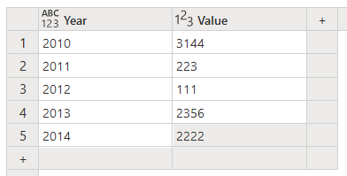
9. When creating a new report, the first step is to add data to the report. Choose the option to paste data into a blank table. Add the data shown below. We wrote our visualization’s logic to consume data in this form. Make sure to add the “Year” and “Value” headers at the top.
Import your visualization
10. Open the Visualizations panel on the right, click the three dots (…), and select Import a visual from a file. Using the file picker, navigate to the generated .pbiviz file and select it. An icon for the imported visual will now appear in a row below the built-in visualizations. Clicking on the icon will add the visualization to your report. It should show up as a placeholder visual.
Map data fields to your visualization’s inputs
6. Next, select the placeholder visual and navigate to its Visualizations panel. There should be a list of one or more Data Fields below the visualization icons.
Map fields from your semantic model (the underlying data source for the report) to each of the visualization’s Data Fields. You can do this by dragging and dropping the fields from the Data panel into each field in the Visualizations panel. Alternatively, you can select the desired fields in the Data panel. This will populate the data fields in the order of selection, so you may need to reorder them in the Visualizations panel.
For our example, you will need to drag the Year field from the Data panel to the Category Data field, and drag the Value field to the Measure Data field.
7. The custom visualization should draw itself once all of the Data Fields are populated.
Congratulations, your custom chart is now rendering your data!
Debugging your custom Power BI visual
Your custom chart has been rendered. That’s exciting, but what if you want to tweak your visualization’s code? Hmmm… Will you need to change the code, repackage the pbiviz file, and re-import it to see the changes? That sounds like a painful development flow.
Fortunately, there is a way to run and debug your custom chart quickly, and it involves using the Power BI Service. If you don’t already have access to the Power BI service, you can start a free trial with Microsoft.
You can run your custom Power BI chart locally while you are developing it. This will create a local endpoint that hosts the visualization’s files. The Power BI Service (the web portal) will access those locally-hosted files and display them in a report via a special “debug visual.” This will allow you to make and save changes locally and see them show up in the Power BI Service right away. This will also allow you to use your browser’s development tools to step through your custom TypeScript logic for debugging purposes. See the steps below on how to set this up.
Set up your visualization to run locally
If you wish to debug your visual locally using the Power BI Service, perform the following steps:
1. Turn on Developer Mode from within the Power BI Service: Go to Settings -> Developer Settings, and turn on Developer Mode.
2. Next, create a local Cert by running pbiviz install-cert from a terminal. This will give the Power BI Service access to your locally-hosted debug endpoint.
3. From the command line, start the visualization by executing npm run start from the visualization’s root directory.
4. Within the Power BI Service create a new report. You will need to manually enter data similar to what we did above with Power BI Desktop
5. Choose the option to create a blank report.
6. In the Visualizations panel, find the Developer Visual icon and click it. This will add the debug visualization to the report.
7. Map the data fields to your visualization’s inputs like we described earlier.
Your chart should now render to the page.
When you save changes to the visualization’s code, the project will automatically be rebuilt and should update within the Power BI report. You might need to manually refresh the visual to see the changes.
On a related note, the Power BI Desktop application does not support this debug functionality. It is only available via the Power BI Service. Note that your custom chart will only show up temporarily in the Power BI Service while you run your visualization locally. It is not uploaded to the Service. That must be done by importing the visual which we described earlier.
Deployment
Once you generate a .pbiviz file you can use it in several ways.
Importing the file directly
During an earlier section, we showed how to import a pbiviz file into a report using Power BI Desktop, but this is also possible using the Power BI Service. Just follow the same steps we described above to import your pbiviz file into a report using the Service.
Publish to Organizations
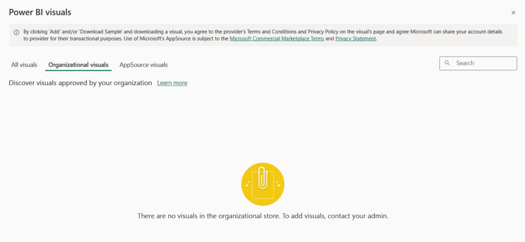
You can publish visualizations to your organization to be consumed by others. To accomplish this, the Administrator of your Power BI workspace will need to import the file using the Administrator tools. Once published, users of that organization will be able to add the visualization using the “…” menu, selecting the Get more visuals button, and selecting the Organizational visuals tab.
Publish to the Public
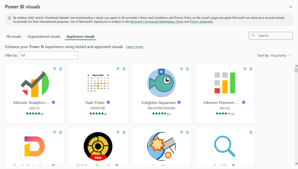
To publish a visualization to the public, it first needs to be certified, meaning that it needs to adhere to specific quality standards and be approved by Microsoft. Once certified, you can add a visual to a report via the “…” menu, selecting Get more visuals, and then selecting the AppSource visuals tab.
Limitations
Data Manipulation
The primary purpose of Power BI is to visualize and filter data. While custom visualizations will ultimately render HTML / JavaScript components, certain events that would typically be available in other web-based frameworks are disabled within the platform. Specifically, events that involve data manipulation or on-demand querying to backend systems will generally not work as expected; for instance onSubmit events on <form> tags do not fire.
For reports that require user interaction and data manipulation (fields, dropdowns, etc), consider leveraging other offerings within Microsoft’s Power Platform. Specifically, you can embed one or more Power Apps within a Power BI report to support user input and data submission.
Data Point Limit
By default, any Power BI visualization will only support displaying up to 1,000 data points at a given time. You can increase this limit to 30,000 for TypeScript visuals by updating the capabilities.json to include a dataReductionAlgorithm within the dataViewMappings object. For Example :
{
  ...

  "dataViewMappings": [
  {
    "table": {
      "rows": {
        "for": {
          "in": "dataset"
        },
        "dataReductionAlgorithm": {
          "top": {
            "count": 30000
          }
        }
      }
    },
  }]
}
For R-based visuals, you can increase the limit to 150,000.
Conclusion
As you can see, Power BI is a versatile tool that you can adapt to fulfill different visualization requirements. It can visualize data with standard built-in chart types, and has the flexibility to enable custom-tailored experiences. Since the custom visualization framework is built upon JavaScript/TypeScript, you can freely load other JavaScript libraries that provide additional structure and functionality, such as Angular, React, and Highcharts. This interoperability allows developers familiar with those frameworks to more quickly design and implement custom visuals.
Today, we’ve shown you how to set up a project for a custom visual and walked through the files you need to know about. We’ve shown how to bundle up and use your visual, and discussed a few limitations to be aware of. Hopefully this gives you a glimpse of how to start creating your own custom Power BI visual.
For more details about Power BI and how to create custom visualizations, check out these resources. To see custom visuals that Microsoft and others have made, head over to the visuals in AppSource.