I don’t often get to share a behind the scenes look at my visual designs, to walk others through the iterations leading up to the version that actually is used. But now that meHive, a relationship management app a team of SEPeers built, has been retired, I thought this would be a good time to do so.
Iterations of the Home Screen
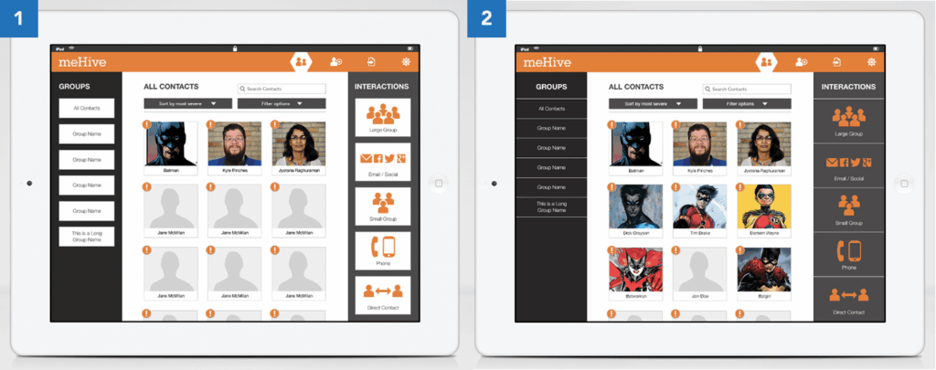
Versions 1 and 2
For the first two iterations of the home screen, I was going for a darker, edgier feel, hence the darker left and right columns. In the interactions column on the right, I particularly liked the contrast of the orange icons over the dark gray (version 2). However, the darker columns served to move all the attention away from arguably the most important part of the screen — your contacts. Also, it was not very apparent that you could interact with all the elements by dragging and dropping. Everything on the screen looked like buttons. So we switched direction.
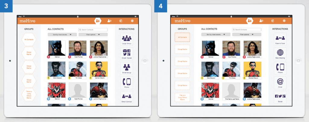
Versions 3 and 4
To bring the attention back to the contacts area, we de-emphasized the left and right columns by going with a very light shade of gray. This gave the app a more light and airy feel that would be carried on throughout the rest of the app. This also brought the app more in line with the look and feel of the then yet-to-be-released iOS7, which was characterized by its use of flat design and minimalism.
We also decided to use dotted lines to denote “drop zones,” which served to make it more apparent that you can drag the contact cards over to the Groups and Interactions columns and drop them into the items there. In version 3 you can see that I used a honeycomb shape for the drop zones to play off of the hive concept. In version 4 you can see that we had to drop that concept to accommodate longer group names.
The Logo
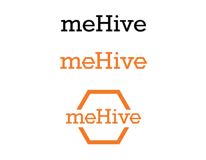
This was one of the ultra rare occasions where I did not need to iterate much on the design of the logo. I can’t emphasize enough in words how rare it is to have a logo design fleshed out without multiple iterations. As you can see, I played off of the “hive” concept and made the letter “e” into a hexagon shape. Having that unique shape for the letter “e” really brought the logo type to life. Contrast that with the standard “e” of the Rokkitt typeface. Not as fun. The choice of the Rokkitt typeface was made because of the popularity of slab serif fonts at the time, which are characterized by thick blocky slabs adorning the letterforms.
What Could Have Been — The Dashboard
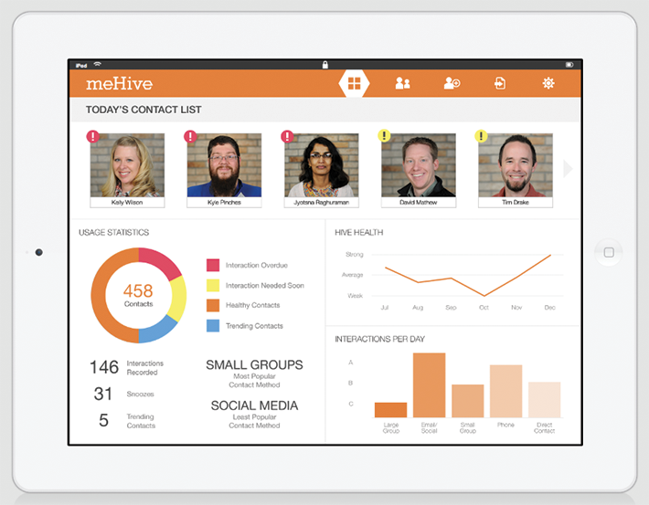
The dashboard above was a concept we worked on but did not implement in the end. This was intended to be the home screen of the app, and would have helped users understand in a very digestible and visual manner the trends in their social interactions. The design was very clean and concise, and came at a time when infographics were very popular.