

Design is everywhere in our lives, whether you notice it or not. We experience it both in the digital world through software, and also in the physical world through things as simple as door handles. Most of the time, these designs and experiences go unnoticed.
However, the most memorable experiences are often the bad ones. If your team is working to create a solid user experience for your product, you will likely need to discuss design concerns with your designers. This can be incredibly tricky if you don’t have the words to describe what you notice in the design. You know something is not quite right, but you can’t really explain why. The good news is that there is a solution for how to talk about design!
Learning some basics of design can help you have a shared language with your designers. This leads to more effective collaboration between design and other areas of your team.
The Gestalt Principles are a great place to start if you’re interested in learning the basics of how to talk about design.
What are the Gestalt Principles?

In 1920, a group of German psychologists created the Gestalt Principles. They were seeking to understand how the brain perceives and interprets the stimuli of everyday life. They discovered when faced with chaotic situations, the brain will find methods to make the information easier to process. These include grouping items, identifying patterns, and simplifying complex objects. The Gestalt Principles became the rules that explain these methods, giving us a great framework for how to talk about design.
There are seven Gestalt Principles:
Why are they important to UX?
The Gestalt Principles explain how human brains process visual information. You can make your product easier to understand by tuning the design to how a user’s brain wants to work. Poor or no usage of the principles makes the user fight their brain’s nature. This leads to bad user experiences, frustration, and even loss of trust in the product.
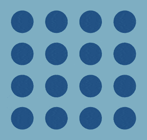
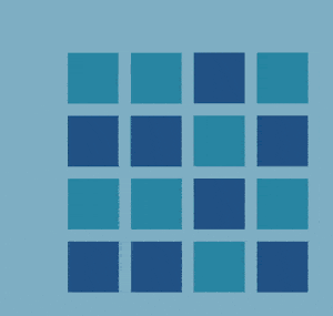
These principles seem like small things, but a little bit can go a very long way. Let’s look at an example:

In the examples above, the design on the left misuses or ignores the Gestalt Principles altogether. The design feels chaotic and confusing. The right example is not only more visually appealing, but it feels easier to understand at a glance. Learning these basic principles helps you know how to talk about design with a designer.
The Principles
Similarity
Similar objects will visually group together and users assume they have similar functions. Common types of similarity are color, shape, size, and layout.
Examples:
- Duolingo: Lessons of the same color belong to the same section. Lessons of the same shape are the same type of lesson.
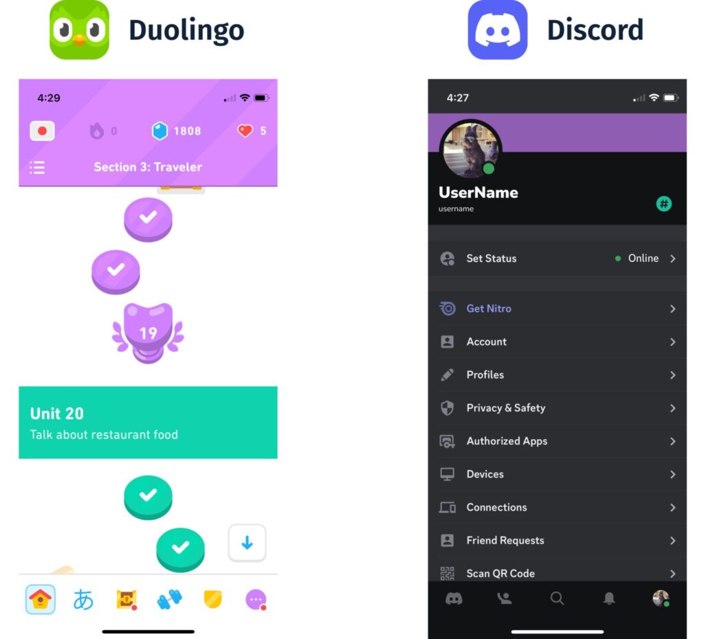
- Discord: All the settings actions follow a similar pattern of icon, title, and arrow. You can assume they all follow the same interaction pattern as well.
Proximity
Objects close together are likely to seem related, especially if they have similar traits. Proximity can “override” similarity. Even if all objects on a page are similar, the ones closer together will visually form a group.
Arranging elements in groups can also make consuming content easier for the user. “Chunking” is often seen with form entries. It’s much nicer to fill out five groups of three entries at a time rather than fifteen entries all at once.
Examples:
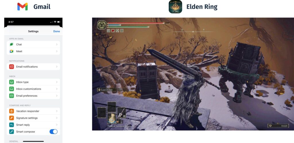
- Gmail: All the Inbox settings are closer to each other than to the Compose and Reply settings. Even though the settings all share the same styling, proximity defines their grouping.
- Elden Ring: All the status effects for the character are grouped together in the top left corner. Indicators related to the character’s equipment form a group in the bottom left.
Common Region
Objects within the same boundary are perceived as a group and are assumed to have common traits or functions. This can be achieved through a variety of visual treatments such as common background color and borders. Common region is a very strong visual principle and can override both proximity and similarity.

Examples:
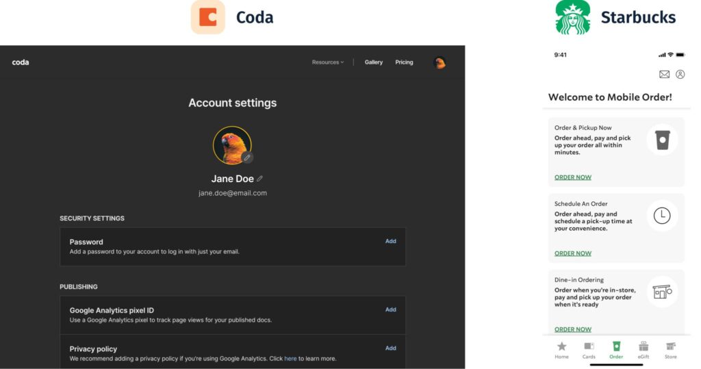
- Coda: Each setting’s title, description, and action is within a common region. Even though the “add” button is far away from the title and description, it still reads as one group.
- Starbucks: Spacing-wise, each “order now” button is closer to the card below. However, the card border groups it with the other information in the card.
Closure
The brain will fill in missing information to perceive a complete object. This kind of visual treatment is often seen in logos, icons, and graphic design. It can simplify complex shapes and reduce how much attention an element draws. Additionally, closure can hint that there is more content that is not in view.

Examples:
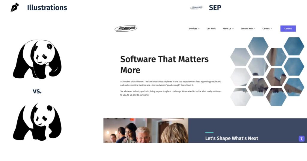
- Panda Illustration: The bottom panda does not have outlines or as many details, but it still reads as a panda.
- sep.com/: The cut-off image and content imply that there is more information below the current view. We also still know the image on the right side is a flying airplane, even though the hexagons break it up.
Continuity
Objects on a line or curve seem more related than those that are not. Our eyes prefer to follow continuous lines from one object to the next. Continuity is another strong visual principle and can override similarity and proximity.

Examples:

- DoorDash: Each row of categories reads as a group. The eye will follow one line of categories instead of bouncing between them.
- Mint: Several lines on this screen intersect, but it is still clear which one is which. Your eye will follow one line continuously instead of jumping to a different one at a sharp angle.
Focal Point
As expected, objects that stand out the most will capture and keep the user’s attention first. Common ways of defining a focal point are:
- Color contrast
- Size contrast
- Different font styles/treatments
- Spatial isolation

Examples:
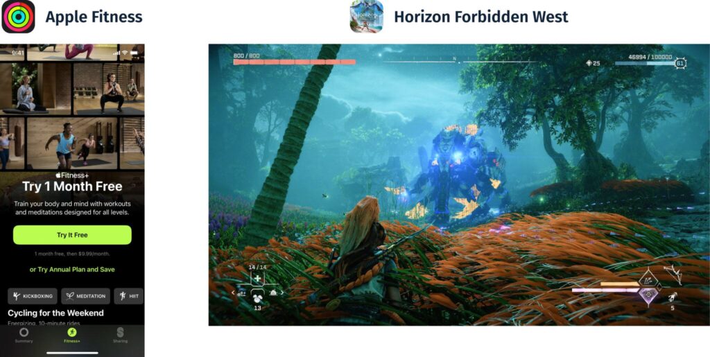
- Fitness+: Apple uses the bright green button to draw the user’s attention to the desired action.
- Horizon Forbidden West: The yellow highlighted sections let players know which areas they should aim for on the machine.
Figure/Ground
The human brain will perceive objects with a sense of spatial relationships. This commonly translates to something being the “figure” in the foreground and the “ground” as the background. This can draw the user’s attention to where you want them to focus.

Examples:

- GitHub: The card in the center of the screen looks like it is in front of the starry background.
- Miniature Quilt: This quilt is a collection of flat strips of fabric sewn together. Due to the layering and color choice, our brain will interpret it as a landscape with depth. The rolling hills are closest, then the lake, then the mountains.
Applying The Principles
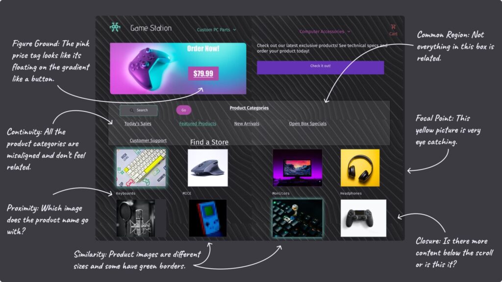
Now that you’ve learned the principles and how to talk about design, let’s look at another example. This website has very poor usage and misuse of Gestalt principles. Take a minute and try to pick out some of the issues.
Here are some examples of issues:
After applying the Gestalt Principles, we can drastically improve this website’s user experience.
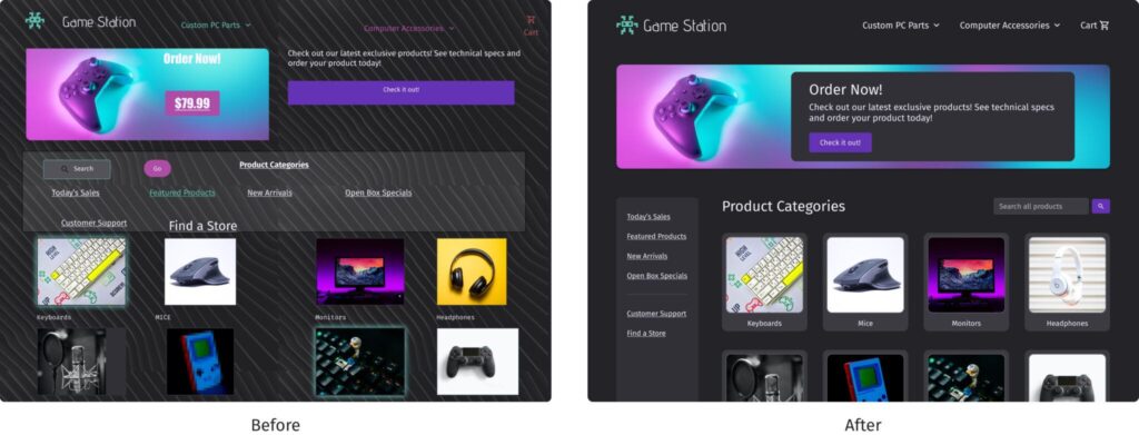
To see how I applied the principles, check out this time-lapse video of my process!
Benefits of Learning How to Talk About Design
Understanding the Gestalt Principles creates a shared language within your team, leading to more time solving real problems and less time defining words. Being able to articulate why a design feels off lowers the barrier to collaboration and in turn, leads to a cleaner and easier-to-understand product. I hope these principles give you the confidence to ask informed questions about design and bring your team closer together in their collaboration!