

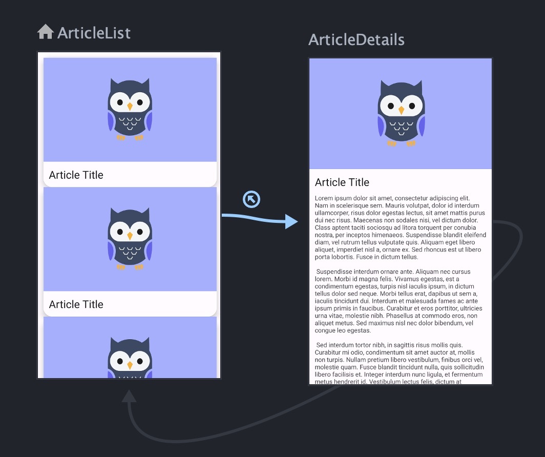
What are Shared Element Transitions?
Shared Element Transitions are animations that move elements from one screen to another within an app. They help users understand how the interface changes when navigating between screens. They are particularly effective when users are browsing diverse content and frequently switching back and forth between screens. These transitions can be simple to design, prototype, and build in code.
How to Design Shared Element Transitions
As with all nuanced or uncommon interactions, we want to start in design so we can visualize what we want to happen before pulling our hair out in code. Figma’s Smart Animate feature is perfect for prototyping shared element transitions.
- Design two screens you want to transition between. Make sure the elements you want to “share” between the views have the same layer name and layer structure in both screens.
- Add a “Navigate to” interaction between the elements
- Set the animation to “Smart Animate”

That was easy! However, there are a few changes we can make to improve this transition
- Simplify the “gesture”. The title and image move in conflicting directions, which makes the overall transition confusing to follow. When all elements move in a cohesive manner, the overall gesture becomes easier to understand.
- Speed it up. People can make decisions on what to do next in as little as 100ms. If your transition takes much longer than that, you are slowing users down. 400ms is a good starting point for full-page transitions. It gives users just enough time to understand where elements have moved.
- Make the spring effect subtler. We can draw less attention to the animation with a subtler easing effect. We want people to focus on the content, not the animation.
Here’s a version that is clearer and less distracting, keeping users focused on the content.
Tips
- Consider creating a separate prototype specifically for demoing this transition. It can be difficult to make Smart Animate work with components, AutoLayout, and other Figma features since the layer structure and naming has to match exactly.
How to Build Shared Element Transitions
You might be thinking, how can I export my awesome transition from Figma? Unfortunately there isn’t a reliable way to go from Figma to code on anything but the simplest projects. However, Implementing shared element transitions can be straightforward. Most platforms provide an API for this purpose. We’ll take a brief look at how to implement this transition style on each.
The Process, Generally
The APIs on these platforms generally follow the same steps:
- Identify elements to be transitioned in both views with a unique id
- Change UI state using a special method that triggers a transition
- Let the platform handle the transition animations automatically
Gotchas
For the most part, implementation should be pretty simple, but there are are a few topics that could require special thought or more work in code.
- Preserving scroll position. you need to ensure that when users close the “expanded” view, the list page returns to the same scroll position as before. This way, users won’t lose their place when switching back and forth between the views.
- Platform features don’t always work well together. Depending on the platform and how your app is set up, you may get frustrated when platform features don’t work well together. Be prepared to compromise, simplify, or abandon this transition style.
- Some users prefer reduced motion. This can be for accessibility or motion-sickness reasons. Many platforms offer features to check if a user has indicated their preference for reduced motion. Look into your platform’s capabilities and consider disabling the animation for those users or offering an alternative like a simple dissolve.
Examples
The code in this article is simplified for brevity. For detailed code examples, I have put together this example repository on GitHub with samples for iOS, Android, and the web.
On the Web
In the past, implementing shared element transitions on the web required careful planning and tricky calculations using the “F.L.I.P. Technique”. However, thanks to the new View Transitions API, creating these transitions is much simpler. With this standardized API, we can smoothly transition between views with just a few lines of JavaScript and CSS.
Give Unique Ids to Shared Elements
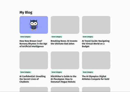
First, we give unique IDs to the elements we want to transition using the CSS rule view-transition-name. These IDs help the browser recognize and move the elements to their desired positions during the transition, just like how matching layer names work with Figma’s Smart Animate. Here is simplified HTML for an article preview in a list:
<article>
  <!-- note that we need unique view transition names per article -->
  <img style="view-transition-name: article-1-image;" src="..." alt="..." />
  <h2 style="view-transition-name: article-1-title;">Example Article</h2>
</article>
And the full article on another screen:
<main>
  <img style="view-transition-name: article-1-image;" src="..." alt="..." />
  <h1 style="view-transition-name: article-1-title;">Example Article</h1>
  <!— ... —>
</main>
Trigger the Transition
When the article is tapped, we will present the full content of the article. To tell the browser these changes are a part of a transition, we have to use a special JavaScript function.
document.startViewTransition(() => changeTheDocumentSomehow());Result
Now, when we click on the article:
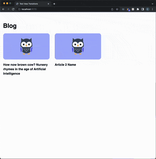
That’s it! As long as the shared elements share the same unique view-transition-name on both screens, they will transition smoothly. It’s not even necessary for the screens to have a similar structure. If desired, you can customize the transition, but the default animation is suitable for many use cases.
Support
You can use the View Transitions API today, although browser support is limited. As of now, you can expect it to work for about 65% of your users. Don’t let this stop you from using the API. Browsers are designed to ignore unsupported CSS rules, so including view-transition-name won’t cause any issues. As for the JavaScript, we just have to check if the startViewTransition function exists before we use it.
if (document.startViewTransition) {
    document.startViewTransition(() => changeTheDocumentSomehow());
else {
    changeTheDocumentSomehow()
}
View Transitions are simple, performant, and concise. They are low-risk progressive enhancements that can make certain kinds of page transitions easier for your users to understand.
Tips
- Give transitioned images a similar aspect ratio in both views. The default animation for view transitions is more of a cross-fade than a blend. Matching aspect ratios will look smoother during the transition.
- For smoother text transitions, consider utilizing the CSS properties
width: max-content;andmax-width: 100%;Depending on the length and style of text, this approach can result in a more seamless blend. Additionally, animating text that has the same or similar number of lines in both views will further contribute to a smoother and more cohesive transition.
iOS and Other Apple Platforms
A SwiftUI View Modifier called matchedGeometryEffect provides a process for animating between views very similar to the web’s View Transitions API. It’s a declarative API that is flexible in terms of layout structure.
Data Model
There are a dozen ways of managing state in Apple apps. Here’s what our Article model looks like.
class Article: Identifiable {
    var title = "How Now Brown Cow? Nursery Rhymes in the Age of Artificial Intelligence"
    var content = "Lorem ipsum dolor ist amet"
    var image = "hexter"

    // MARK: for animations
    var titleId: String { "article \(id) title" }
    var imageId: String { "article \(id) image" }
}
Note titleId and imageId. These will give us ids for shared elements that are unique per article. This is needed to distinguish between articles.
Create The List and Detail Views
Next, lets create a View that changes based on some state.
enum BlogViewState {
    case normal
    case article(article: Article)
}

struct BlogView: View {
    //...

    @State private var state: BlogViewState

    var body: some View {
        switch state {
        case .normal:
            // show a list of articles...

        case .article(let article):
            // show the full article...
        }
    }
}
Set up the Transition
Next, we add a namespace for this animation. SwiftUI uses namespaces to prevent animations from conflicting.
struct BlogView: View {
    //...
    @Namespace private var articleAnimationNamespace
}
Next, we add the .matchedGeometryEffect modifier to the elements we want to transition. We need to give the shared elements matching ids on both views.
case .normal:
    // somewhere in a list of article previews ...
    Text(article.title)
        .matchedGeometryEffect(id: article.titleId, in: articleAnimationNamespace)
    Image(article.image)
        .matchedGeometryEffect(id: article.imageId, in: articleAnimationNamespace)

case .article(let article):
    //...
    Text(article.title)
        .matchedGeometryEffect(id: article.titleId, in: articleAnimationNamespace)
    Image(article.image)
        .matchedGeometryEffect(id: article.imageId, in: articleAnimationNamespace)
Trigger the Transition
Now, we’ll add some code to switch between the views. Note that we need to change the state using a special method withAnimation to tell SwiftUI that the change should trigger a transition.
case .normal:
    // ...
    VStack {
        // article preview layout...
    }
    .onTapGesture {
       withAnimation {
           state = .article(article: article)
       }
    }
Result
Now, when we tap on the article:

In theory, the process is concise and straightforward. However, in practice, these transitions can require lots of trial-and-error to get right, particularly when combining them with other SwiftUI modifiers like .edgesIgnoringSafeArea. If you intend to use this API, I suggest starting your experimentation in code before choosing a design. It could save you a lot of frustration.
Support
.matchedGeometryEffect is supported on iOS 14 and later, which is widely adopted. If you need to support older iOS versions, you may need to add a check for the iOS version to prevent errors.
Tips
- Experiment with the
properties:andanchor:arguments ofmatchedGeometryEffect. Text boxes, for example, should not animate their size because the characters will wrap, and they should have a stable top leading corner when moving. - Experiment with the structure of the elements. Things like
.clipPathandScrollViewcan have various undesirable effects on the transition.
Android
Shared Element Transitions in Android can be implemented in quite a few ways. It’s difficult to tell exactly which method is best. It will depend highly on how your app navigation is set up. I will show one way that works with Android’s newest graph-based navigation. I won’t explain as much of the Android code because it’s a bit more verbose than other platforms.
Set up Navigation
First, set up your navigation graph. A navigation graph describes how users can navigate between screens in your app. I have two screens that users can navigate between, a list view and a detail view. The navigation graph looks like this in Android Studio:
The Article Class
There are a thousand ways to manage state in Android. Our article data looks something like this:
data class Article(
    val title: String,
) {
    val id = UUID.randomUUID().toString()
    val imageId: String get() = "article $id image"
    val titleId: String get() = "article $id title"
}
Note imageId and titleId. This gives us unique ids that we can use to identify shared elements on the source and target screens. If they weren’t unique, Android won’t be able to distinguish article images and titles from each other on the article list page (and the program will crash!).
Setting up the Source View (the List View)
First, in the code for the list view, we apply the ids to each shared element’s transitionName.
val article = articles[index]
// ...
listItem.textView.transitionName = article.titleId
listItem.imageView.transitionName = article.imageId
Next, when we tap the article, we navigate to the target view (the detail view). When we do this, we have to add some extra info to tell Android to transition the shared elements.
val extras = FragmentNavigatorExtras(
    textView to article.titleId,
    imageView to article.imageId
)
view.findNavController().navigate(R.id.articleListToDetails, null, null, extras)
Setting up the Target View (the Detail View)
On the target view (the article detail view), we need to add an enter transition. First we create an xml file at res/transitions/shared_element.xml. This file tells Android what it should animate on the shared views.
<?xml version="1.0" encoding="utf-8"?>
<transitionSet>
    <changeImageTransform/>
    <changeBounds/>
    <changeTransform/>
</transitionSet>
Next, apply the enter transition to the target view.
override fun onCreate(savedInstanceState: Bundle?) {
    // ...
    sharedElementEnterTransition = TransitionInflater.from(requireContext())
        .inflateTransition(R.transition.shared_element)
}
Finally, since we need the transitionNames to be unique per article, we have to set these ids dynamically in the detail view. More, we need to set the ids before the transition starts. Android provides postponeEnterTransition() and startPostponedEnterTransition() for this purpose.
override fun onCreate(/* ... */) {
    // ...
    postponeEnterTransition()
}
Now, we add transitionNames to the shared elements.
override fun onCreateView(/* ... */) {
    // ...
    val title = view.findViewById<TextView>(R.id.article_title)
    title.transitionName = article.titleId

    val image = view.findViewById<ImageView>(R.id.article_image)
    image.transitionName = article.imageId
}
Finally, we resume the transition once the view has finished initializing.
override fun onViewCreated(/* ... */) {
    // ...
    startPostponedEnterTransition()
}
Result

Once you find the correct transition process to use for your navigation setup, it should be fairly straightforward to implement. Though, since Android requires more setup and more files than other platforms, it will take some time and debugging to make things work as expected.
Cross-Platform
Similar solutions are available on popular cross-platform solutions as well. I haven’t explored these thoroughly.
React Native
There’s no built-in process for shared element transitions. But react-native-shared-element is a popular community library for achieving this effect. For those looking for something closer to a standard API, Expo (one of the de-facto standard frameworks for react native) is working on an API for this. It’s in alpha, so it’s not yet ready for use.
Flutter
Flutter calls these transitions “Hero animations,” presumably because elements “fly” from one screen to the other. I haven’t tried it yet, but the API seems about as simple as the web’s View Transitions API.
Shared Element Transitions Can Be Easy
You can build these view transitions today on some platforms without too much of a hassle. But expect some degree of debugging and compromise. If you’re interested in digging deeper to see what it takes, take a look at working example code at this GitHub repo.