A Tale Old As Time
Humans have had the tendency to be deceptive to one another for longer than any existing historical document can recall. One of the most infamous examples of this act being used as a literary device is the myth of the Trojan Horse in Homer’s Odyssey. This victory trophy, given to the Trojans by the Greeks, spoilers ahead – was a deceitful ploy filled with Greek warriors who would lead the Greeks in the final battle that destroyed the city of Troy and in turn, ended the Trojan War. Although this is a story from centuries ago, this kind of deceitful tactic is what modern user experience designers would call a dark pattern.
History Repeating Itself
Pretty dramatic stuff, right? Well, these same themes found in literature are seen in many of today’s designs. The instances of dark patterns found in today’s technology are not quite to the scale that led to the destruction of a city, but we must be cautious of the slippery slope they can create. A more modern and relatable example of a dark pattern would be an online purchase. Have you ever bought something online only to then be signed up to receive a litany of marketing emails you unknowingly signed up for? Same. What you and I probably both missed as we checked out our cart was the small pre-checked box in the bottom corner of the screen that was barely visible and poorly worded that then authorized the seller to bombard us with emails. This is a modern-day dark pattern.
A dark pattern is defined as, “…tricks used in websites and apps that make you do things that you didn’t mean to, like buying or signing up for something.”1. The term was first established by Harry Brignull in 2010 and still remains a very relevant term in today’s digital landscape. In fact, Brignull is still calling out this issue today with his site Deceptive Design. Many dark patterns involve a manipulative use of Nielsen Norman Group’s 10 Usability Heuristics. If you are more familiar with information security trends, think of a designer using dark patterns similar in nature to a black hat hacker. Funny enough, these kinds of hackers have a tactic quite literally nicknamed after the story I mentioned above known as a Trojan Horse Virus. In the same way an information security professional can use their skill set in both ethical and unethical ways, so too can a designer. Right about now, you may be asking yourself, “How do I spot a dark pattern?” and I would be happy to give you a more detailed illustration and explanation below.
Three for One
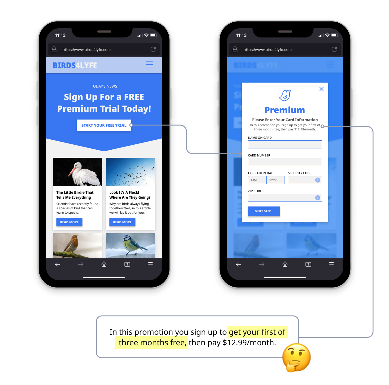
The screens below are an unfortunately ubiquitous experience with just about any “free” trial you find online. In fact, the below example is an offender of 2 specific dark patterns. You will find many common dark patterns are used in tandem with one another, oftentimes creating quite an unpleasant user experience, but providing “better” metrics and results. I use better in quotes because though the quantity of data being captured may be greater, the quality of the data more often than not suffers. More on that later.
Looking closer at the example above, the phrasing makes this a pretty obvious Bait and Switch. A Bait and Switch is defined as, “You set out to do one thing, but a different, undesirable thing happens instead.”1 On initial understanding, the user is under the impression that what they are signing up for is free. Yes, the first month is technically free, but the problem here is there is no true way to get that one free month. Reading more carefully, you can see that the user is agreeing to actually 3 months upfront. If users were to complete this form, they are more than likely committed to more of an expense than they realize. Here is where the second dark pattern comes into play. Forced Continuity is, “When your free trial with a service comes to an end and your credit card silently starts getting charged without any warning. In some cases, this is made even worse by making it difficult to cancel the membership.”1.

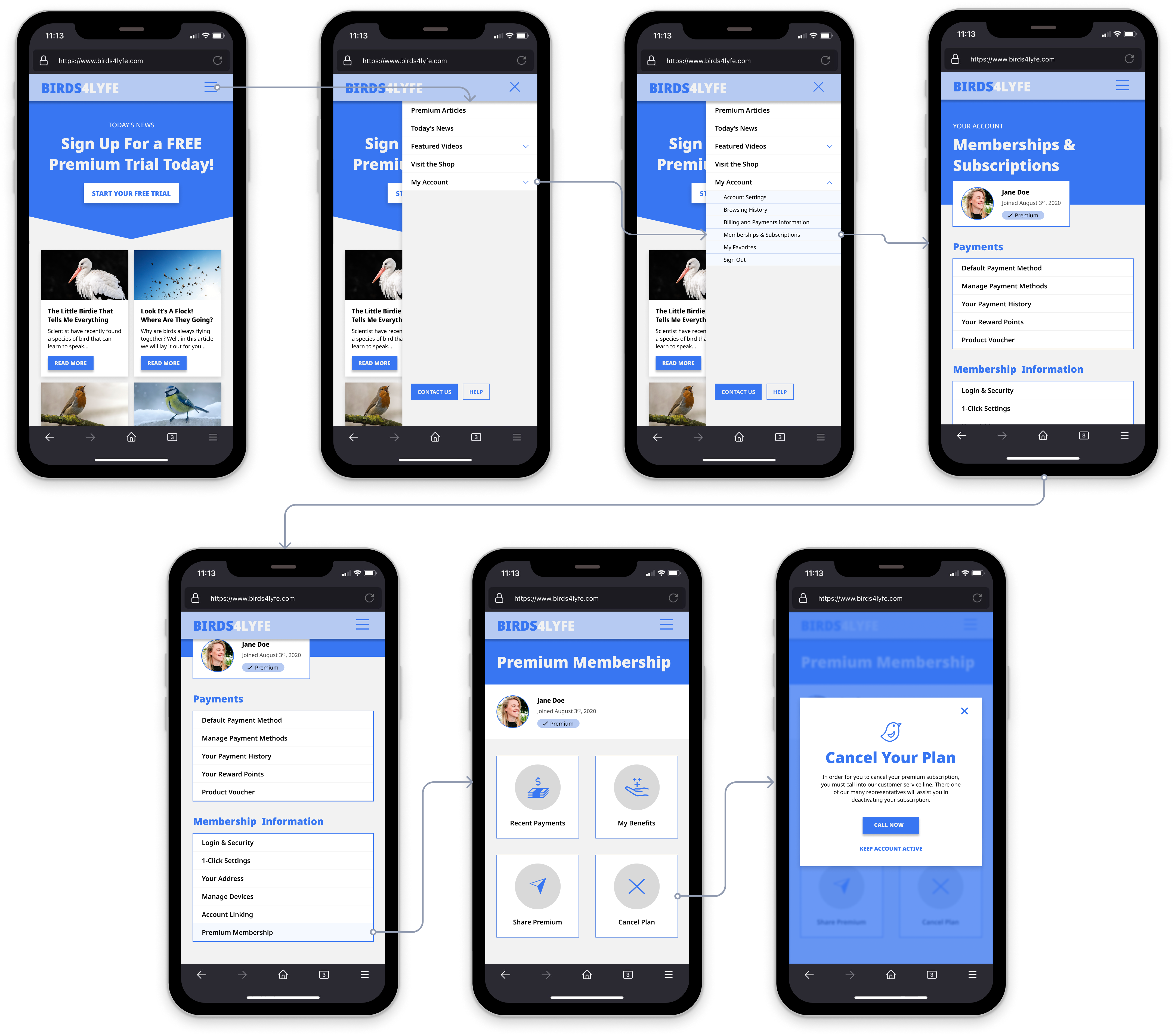
If we want to get even more critical, that last sentence in the previous definition alludes to a third tactic known as a Roach Motel, which is intentionally designed to make it far more difficult to exit than it is to enter. Like many other subscription-based services, the above example I have illustrated makes it far more challenging to cancel a plan than to sign up. It took 2 interactions to sign up, whereas it takes upwards of 6+ interactions and then relying on customer service to properly deactivate a membership. By now, I am sure you are able to relate to one of the three dark patterns I’ve mentioned.
Now What?
The above examples highlight only a few of the many common dark patterns practiced today. So, what is being done to prevent these kinds of trends from proliferating even further? Steppingstones are being put in place by the European Union (EU) and their establishment of the General Data Protection Regulation (GDPR) as well as The State of California and its creation of The California Consumer Privacy Act of 2018 (CCPA). Both of these regulations are forward progress and help protect users’ privacy, but they are limited to specific geographies. Additionally, many are skeptical of how well these kinds of regulations are enforced and if they are causing any change. Without going into too much detail, when a company has violated these regulations the fine they are hit with is oftentimes too small to make a significant impact on the business’s data privacy practices. Because modern regulation is not cutting down on these dark patterns, how do we protect user privacy while maintaining an ethical and mutual relationship between both businesses and users?
For The User
As users of modern technology, which is all of us, we need to stay informed and have a keen eye for these suspicious practices. When we stumble upon one, there are two primary courses of action we can take to combat the unethical tactic at hand. First and foremost, take our business elsewhere. Understandably, this can be easier said than done, but if users in droves abandon technology that preys on them, that technology will have no other choice than to change its ways in order to remain a viable offering for a business to maintain. The other, louder tactic that is promoted by Bringull over at Deceptive Design is to spread the word about a dark pattern publicly. This tactic, although a little blunter, applies great pressure on businesses to address the issue at hand. This does not give the user the right to harass companies on social feeds, but rather call attention to the matter in a civil manner. To avoid these pressures, I would like to encourage businesses to combat these tactics as well, especially because of how short-sighted the end goal of many dark patterns is.
For The Business
Most, if not all, businesses strive to find sustainable practices that enable long and steady financial growth. And though dark patterns clearly have quick, beneficial results, the longer-term consequences can be detrimental to a business’s longevity and can even permanently damage its integrity with its client base. Just because competition is falling victim to these manipulative trends, doesn’t mean they necessarily work and that you should follow in your competitors’ footsteps. Instead, take the alternate path and take the opportunity to prove yourself as the business that respects its customer. Be different and be better! Michael Craig over at Toptal.com does an excellent job of identifying several, easy to fall into dark patterns and then offers alternatives that aren’t so manipulative of the user interacting with the product at hand. Implementing these alternative designs will not only make your users have a far more enjoyable experience and positive outlook on your brand, but your designers will have no hesitation in assembling an experience that respects the user.
For The Designer
While we are on the topic of designers, it is ultimately up to us to resist the trends that are dark patterns. As designers, it is our job to educate our teams and employers on the importance of ethical design. Not only for our moral sanity, but also for the long-term success of whatever project we work on or the business we work with. I like to believe there are solutions to all dark patterns that equally benefit both the business and the user. However, these solutions will not be discovered unless we begin having more discussions around the topic. And although these discussions and even discourse might be a bit uncomfortable at times, borrowing from ideas stated in Jessica Helfand’s Design: The Invention of Desire, designers are well equipped to struggle through the unknowable and transform it into something far more understood and accepted.
Conclusion
There is a lot more that could be said about dark patterns, but instead of rambling on, I encourage you to take the next steps in learning more. Throughout this blog, I referenced many other resources that I hope might already be open in other tabs on your browser by the time you have read this far. Remember that the software and products we are responsible for designing almost always have a user on the other end. That user is human, just like you. Empathy is a critical component of all user experiences, and it must be taken into consideration. We wouldn’t subject ourselves to exploitative tactics, so why do it to customers and clients? As with anything in this world, there is always a balance. That balance isn’t always the most easily achieved, but with careful examination and thorough planning, it can be discovered. As makers, it is up to us to discover and then design that sustainable balance of a long-term correspondence, ultimately benefiting both users and businesses alike.
References
- Bignull, Harry. “Deceptive Design – Formerly Darkpatterns.org.” Deceptive Design (Formerly Darkpatterns.org), https://www.deceptive.design/.
- Brignull, Harry. “Dark Patterns: Inside the Interfaces Designed to Trick You.” The Verge, 29 Aug. 2013, https://www.theverge.com/2013/8/29/4640308/dark-patterns-inside-the-interfaces-designed-to-trick-you.
- Craig, Michael. “The Danger of Dark Patterns (with Infographic).” Toptal Design Blog, Toptal, 20 Oct. 2021, https://www.toptal.com/designers/ux/dark-patterns.
- Helfand, Jessica. Design the Invention of Desire. Yale University Press, 2016.
- Nielson, Jakob. “10 Usability Heuristics for User Interface Design.” Nielsen Norman Group, Nielsen Norman Group, 19 Nov. 2015, https://www.nngroup.com/articles/ten-usability-heuristics/.
- Ravenscraft, Eric. “How to Spot—and Avoid—Dark Patterns on the Web.” WIRED, 29 July 2020, https://www.wired.com/story/how-to-spot-avoid-dark-patterns/. Accessed 10 May 2022.
- Vincent, James. “California Bans ‘Dark Patterns’ That Trick Users into Giving Away Their Personal Data.” The Verge, The Verge, 16 Mar. 2021, https://www.theverge.com/2021/3/16/22333506/california-bans-dark-patterns-opt-out-selling-data.
