UX Articles
We’re curious people by nature. And we love to teach others what we’ve learned. So explore our blog to gain fresh insights from our expertise in areas ranging from culture to AI.
SEP Wins TechPoint’s 2025 Exceptional Employer Mira Award
SEP Recognized as Indiana’s Top Tech Employer, Winning TechPoint’s Prestigious Mira Award Westfield, Indiana - SEP has been named Exceptional Employer by TechPoint at the 26th annual Mira Awards. This award recognizes companies that are developing talent through skills-based hiring…
Read Full Post

Design is everywhere in our lives, whether you notice it or not. We experience it both in the digital world through software, and also in the physical world through things as simple as door handles. Most of the time, these designs and experiences go unnoticed. However, the most memorable experiences are often the bad ones. […]
Read Full Post

Don’t Underestimate the Power of Good UX Writing in Product Design
As a Senior User Experience (UX) Designer, I’m often biased toward products that look good and function seamlessly. But the words that appear within those beautiful and functional designs are just as important in helping users navigate and interact with a product. This important component of my job is known as UX writing. Full disclosure: […]
Read Full Post

How Interaction Design Changes Our World, One Interaction at a Time
I walk into the kitchen for coffee, and my Google Home says, “Good morning!” My schedule for the day pops up on the screen. The assistant tells me how long it will take to get to work now that I have started driving my son to school. In the car, the map and arrival estimates […]
Read Full Post

How Designers and Developers can use Shared Element Transitions to Improve UX
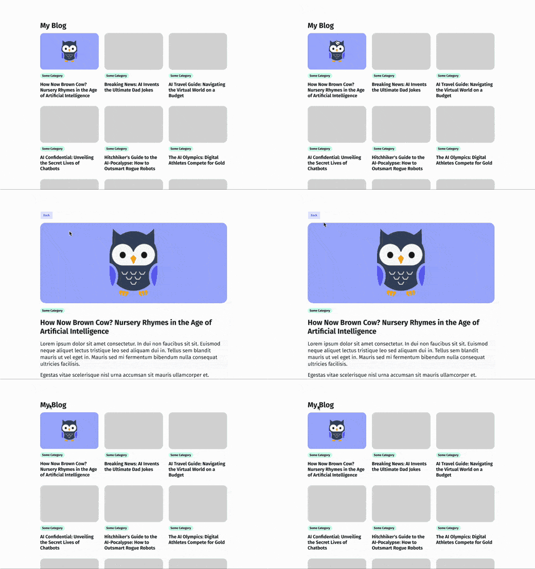
What are Shared Element Transitions? Shared Element Transitions are animations that move elements from one screen to another within an app. They help users understand how the interface changes when navigating between screens. They are particularly effective when users are browsing diverse content and frequently switching back and forth between screens. These transitions can be […]
Read Full Post

The Building Blocks of Design Hierarchy
Creating beautiful, well-laid-out screens may seem like design magic, but you don’t have to be a designer to know how to structure your content well. With just a few key fundamentals of hierarchy, you can drastically improve both the visual appeal and usability of your designs. What is hierarchy and why is it important? According […]
Read Full Post

10 Figma Shortcuts to Improve Your UI Design Proficiencies
Though most shortcuts in work are ill-advised or perceived as lazy, some have proven otherwise. As Figma has exploded in use amongst many in the design field these last few years, almost all SEP’s designers have adopted this tool in their own unique way. Like artists, designers have their own approach to the pieces they […]
Read Full Post

Welcome to the Dark Side: 5 Tips for Designing a Dark Mode Version of Your App
Are you thinking of coming to the dark side? 🦇🖤 Designing in dark mode continues to grow in popularity, especially following the implementation of optional dark mode for Apple iOS, Facebook, Google Chrome, Youtube and other highly trafficked sites and operating systems (source). But what is dark mode? If you aren’t familiar with it, dark mode […]
Read Full Post

Friday’s 13 Tips to Overcome Design Workshop Facilitation Nerves
Facilitating design workshops can oftentimes feel as scary as Friday the 13th. The nerves that build up moments before meeting with a client can feel the same as the nerves I would get as a kid while watching the classic 80’s slasher film as Jason skulked around Camp Crystal Lake. In both scenarios, I was/am […]
Read Full Post

Circumventing The Dark Side of Design
A Tale Old As Time Humans have had the tendency to be deceptive to one another for longer than any existing historical document can recall. One of the most infamous examples of this act being used as a literary device is the myth of the Trojan Horse in Homer’s Odyssey. This victory trophy, given to […]
Read Full Post